
Overview
Claude Fable 5.1 is very good at producing a credible first UI direction, especially when the product has clear information architecture and realistic constraints. Across three very different tests, it made strong decisions about hierarchy, typography, spacing, density, and visual tone without falling back to the same generic AI dashboard every time.
The caveat is important: it still needs designer judgment. Fable 5.1 can get you from a blank canvas to something worth reacting to in minutes, but the final 10 to 20 percent still depends on a human noticing awkward interaction choices, missing product logic, and details that look polished without being fully resolved.
What is Claude Fable 5.1?
Fable 5.1 is Claude's newer model for demanding coding and agentic work. Anthropic positions it as a stronger, more efficient successor to Fable 5, with improvements aimed at long-running tasks, self-verification, and the quality of finished artifacts.
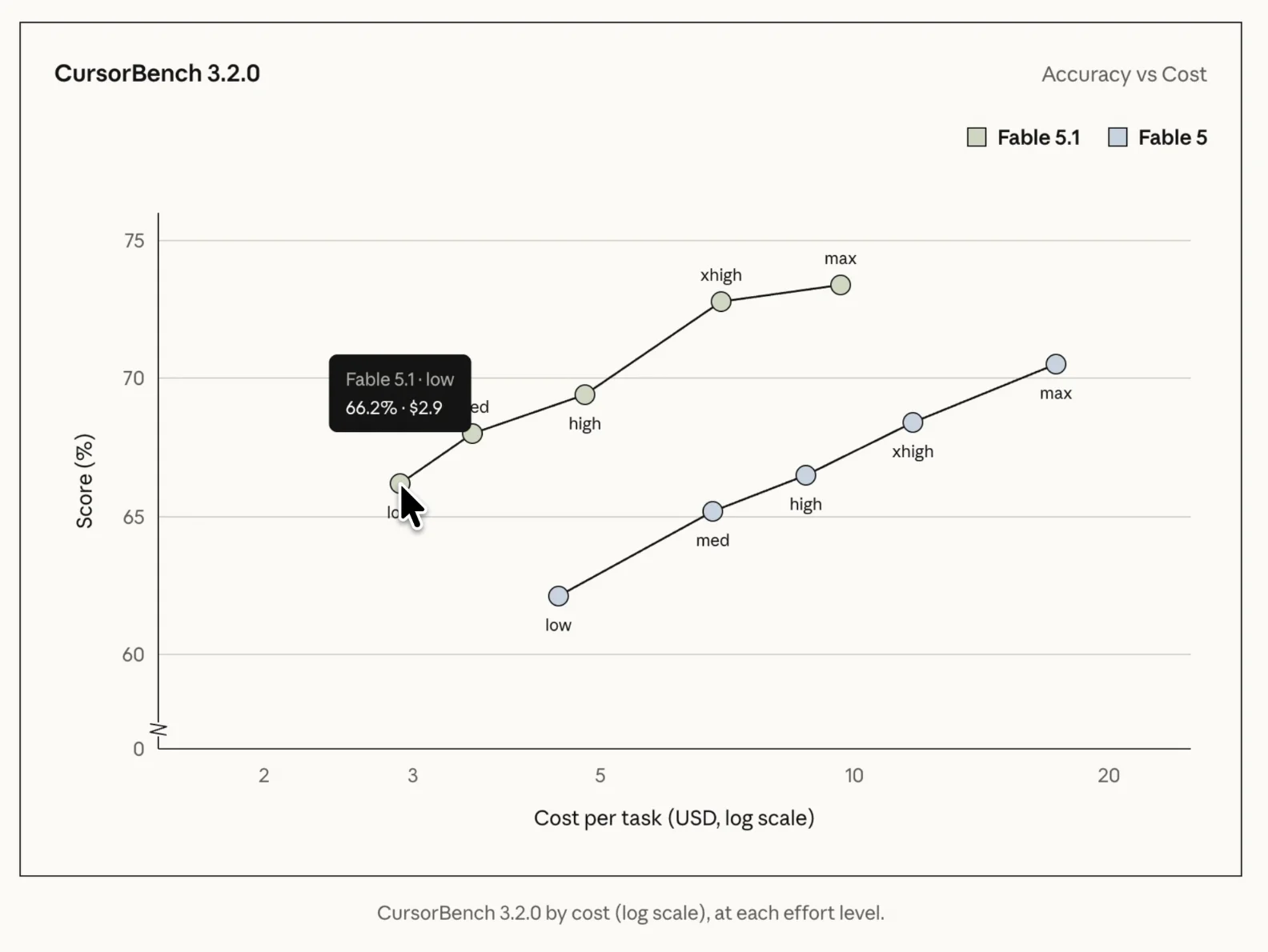
The benchmark story is useful context, but it does not tell a designer whether the model can establish a visual direction, manage hierarchy, or keep a complex interface coherent. That is why I tested the output as design work rather than treating coding scores as a proxy for taste.
In the video, the agentic coding comparison shows Fable 5.1 reaching a similar score at low effort to Fable 5 at high effort. The more practical question is whether that capability turns into noticeably better interfaces.
OpenAI shipped GPT-6 Astra the same week. I gave it a very different brief, an image-heavy landing page built with Images 2.0 inside Codex, and the comparison is worth reading alongside this one: I Tested GPT-6 Astra for Web Design (with Images 2.0)
How I tested Fable 5.1 for UI design
I used three briefs that stress different parts of interface design. The finance dashboard tests hierarchy, data visualization, density, and polish. The personal-site redesign tests art direction, typography, and the model's ability to learn from references. The professional video editor tests whether it can organize a genuinely complex workspace without flattening everything into a simple web-app layout.
Each test started with a clear product goal. I reviewed the first pass like a designer, then gave one focused round of feedback. That matters because a useful AI design tool should not only produce an attractive screenshot; it should respond intelligently when the direction needs refinement.
Test 1: a personal finance dashboard from scratch
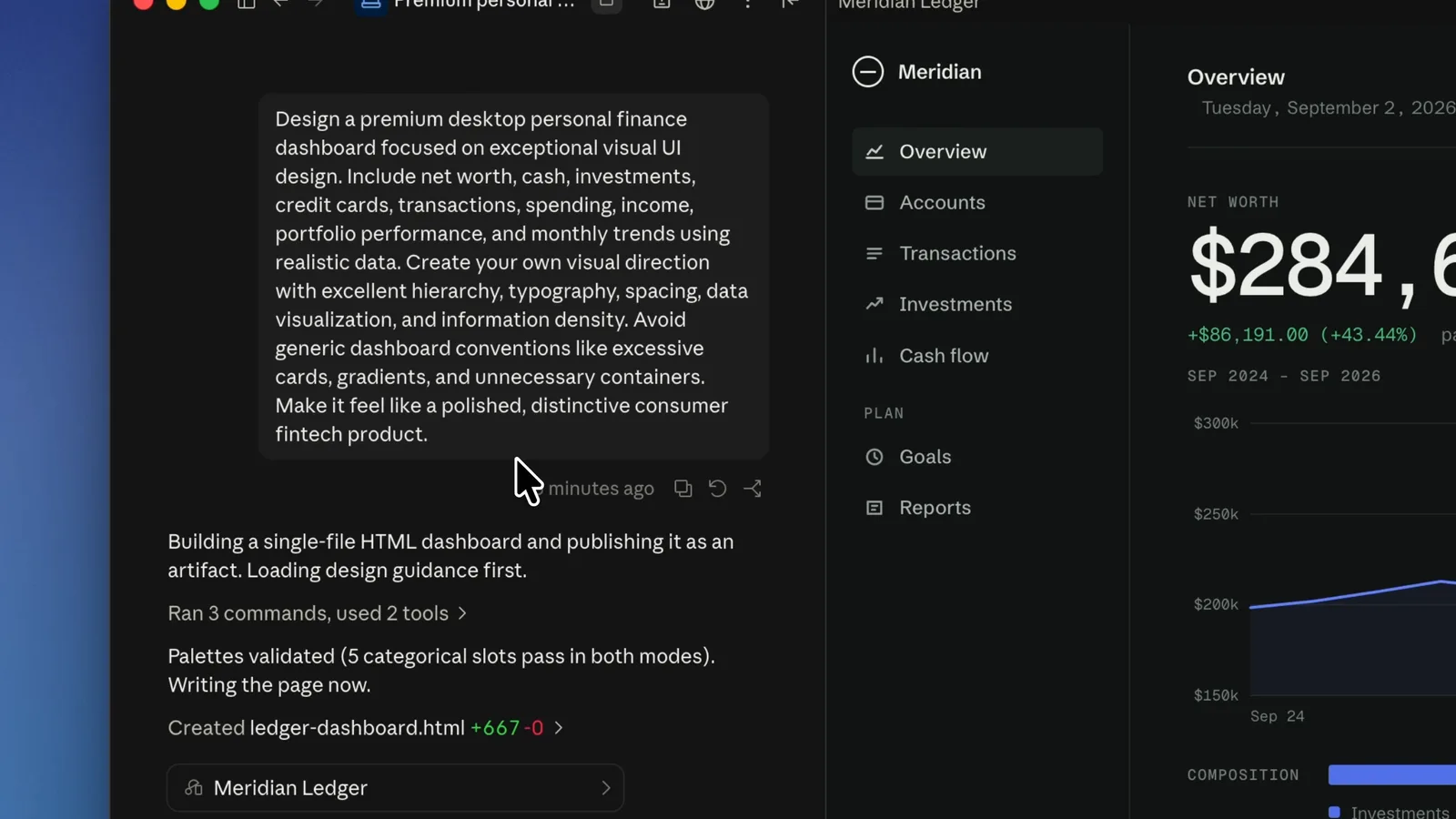
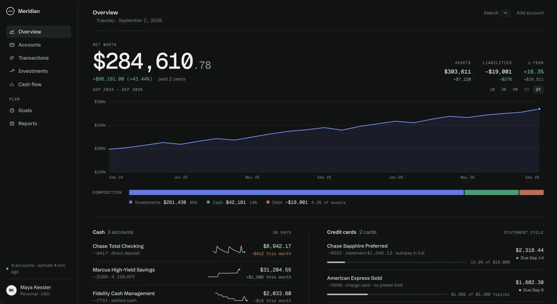
The first challenge was a premium desktop personal finance dashboard with no visual references. I wanted to see what Fable 5.1 would invent on its own, and whether it could make a data-heavy product feel calm rather than crowded.
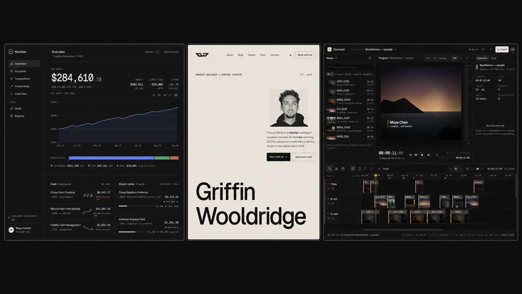
This was the strongest result. The interface establishes a clear reading order around net worth, uses quieter type for supporting values, and reserves color for trends and meaningful states. The chart, cash accounts, liabilities, navigation, and secondary data all feel like parts of one system rather than separate generated cards.
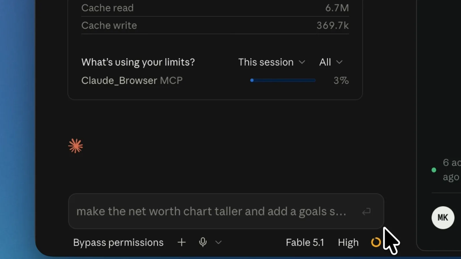
Fable also added working touches such as chart tooltips and a consistent dark theme. A few navigation decisions were more decorative than product-driven, but the visual hierarchy and density were unusually controlled for a first pass.
Test 2: redesigning my personal website with real references
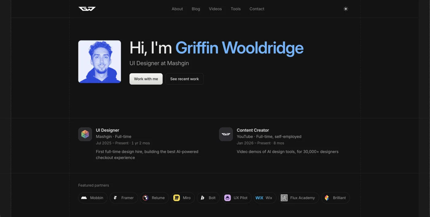
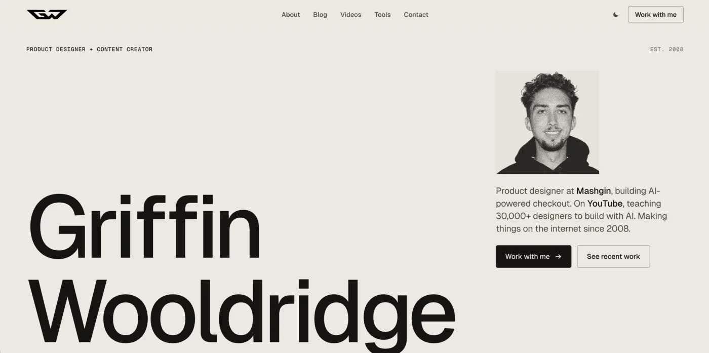
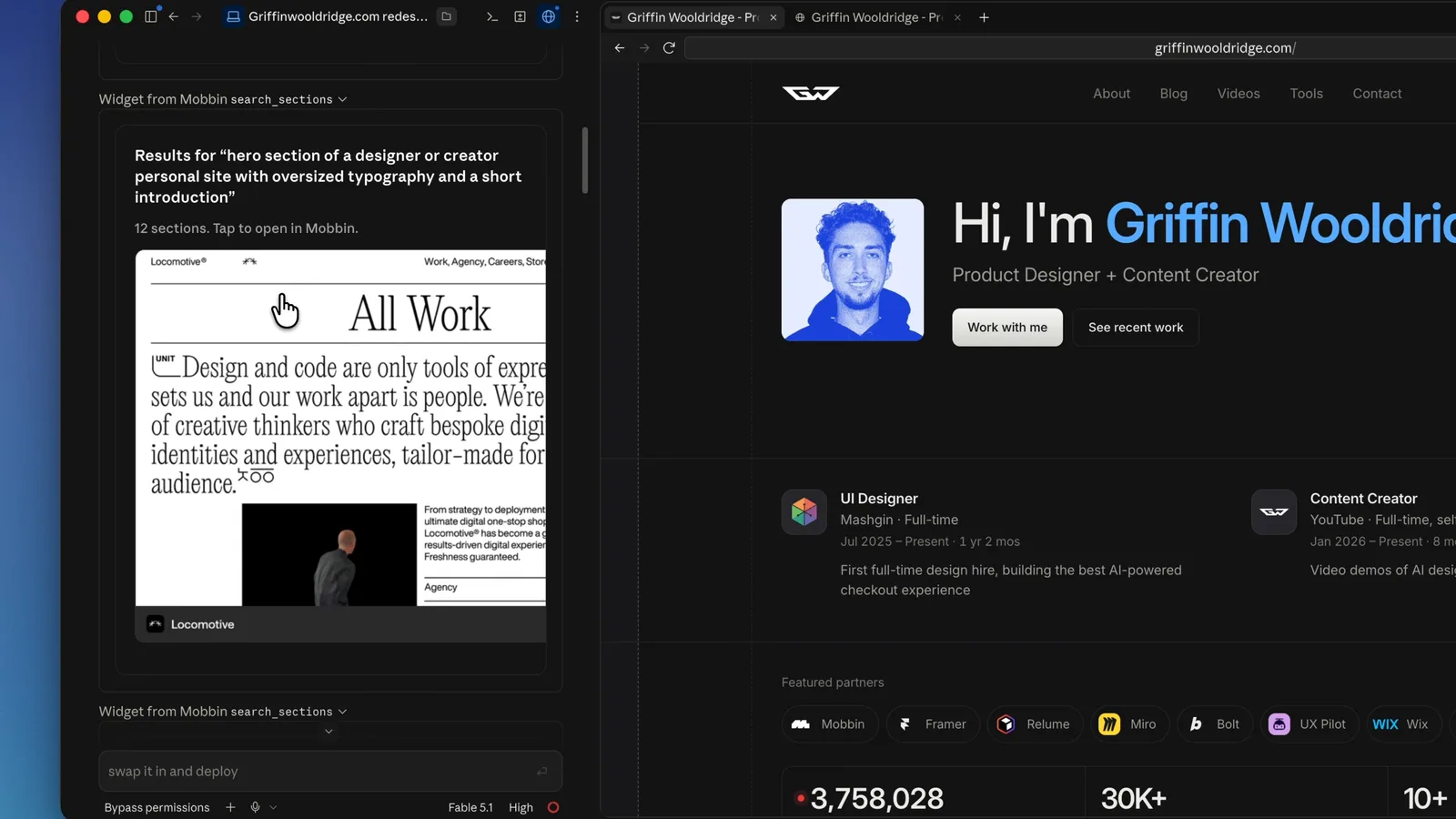
For the second test, I asked Fable 5.1 to redesign griffinwooldridge.com as a polished, modern portfolio. This time I did not want the model relying only on its training data, so I had it research relevant patterns through the Mobbin and 21st.dev MCP servers before designing.
That reference layer helped. The final direction kept the site's editorial content and monochrome foundation, then pushed the typography, scale, and composition into something more expressive. The oversized name, restrained navigation, split hero, and project framing feel intentional rather than like a portfolio template with different copy dropped in.
The weak spots appeared when visual direction met implementation detail. Some spacing and interaction choices still needed correction, and the model occasionally optimized for a dramatic screenshot over the way the page should behave. Even so, the art direction was strong enough to prove that grounded references materially improve AI-generated UI.
The five reference sites I rotate between, and the order I use them in, are laid out here: Stop Letting AI Design From Scratch: 5 UI Reference Sites The Mobbin MCP setup itself is here: Mobbin MCP: 600,000+ Real References Inside Claude Code
Want the same reference workflow? Get 20% off Mobbin here:  Mobbin
Test 3: designing a professional video editor
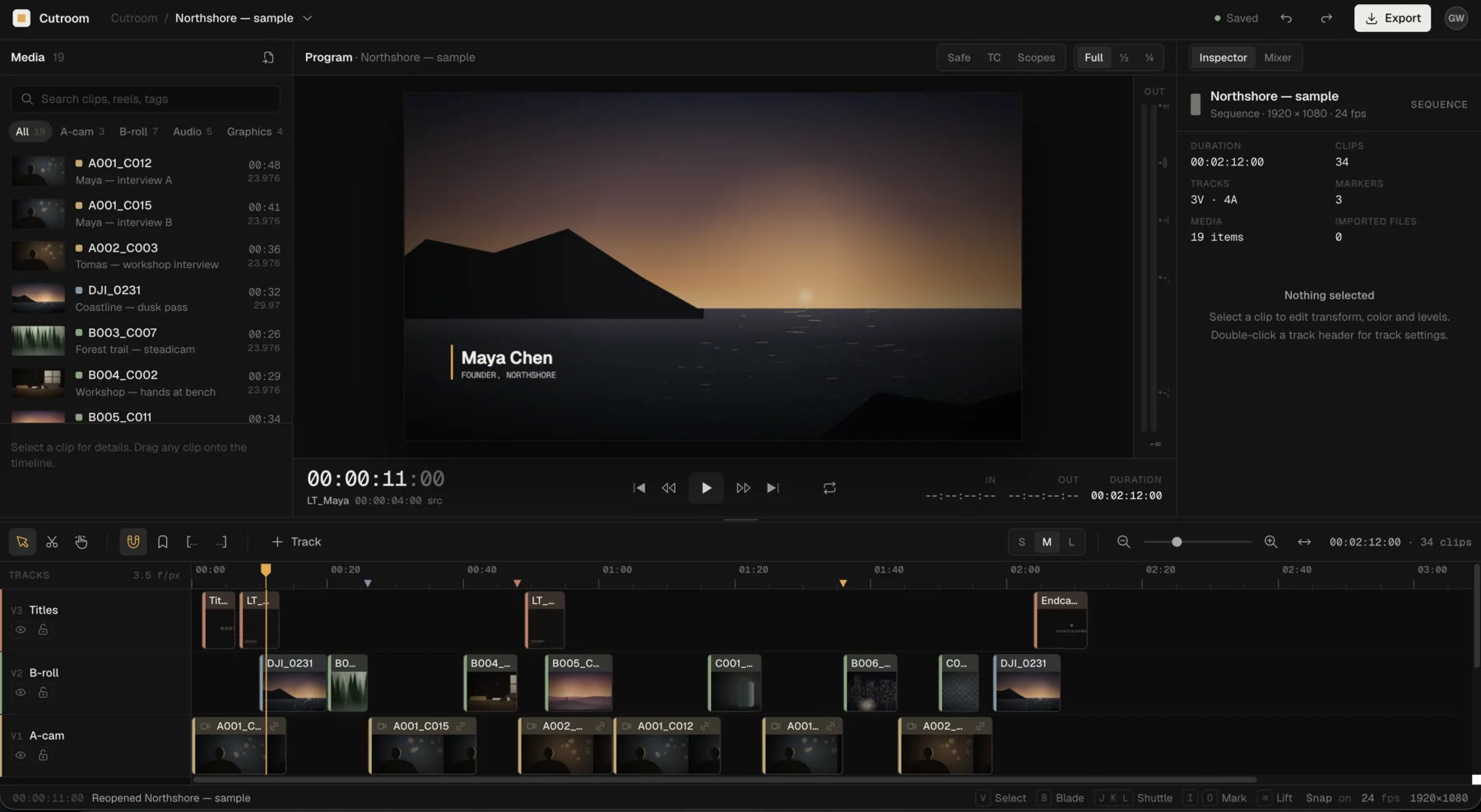
The final brief was deliberately harder: create a full professional video editor from scratch. A convincing editor needs a timeline, preview, media and tool panels, tracks, transport controls, inspectors, and dozens of small states, all competing for limited space.
Fable 5.1 produced a surprisingly credible professional shell. The timeline dominates the lower workspace, the preview remains visually central, and the surrounding tools are dense without becoming unreadable. It understood the visual grammar of a desktop creative tool instead of turning the brief into another dashboard.
Interaction depth was the real limit. Dragging clips, managing tracks, trimming media, and handling selection states expose product decisions that cannot be solved by surface polish alone. Still, getting this much coherent structure from one prompt makes the result an excellent prototype and a strong foundation for iteration.
Results at a glance
What Fable 5.1 did well
The biggest improvement is that the model can make different products feel different. The dashboard is restrained and analytical, the portfolio is editorial, and the video editor is dense and utilitarian. That range is a better signal of design ability than one beautiful landing page.
It was consistently strong at three things:
Establishing a clear visual hierarchy before adding detail.
Using typography, spacing, and contrast as a system rather than styling each component independently.
Holding a coherent direction across a large interface without obvious visual drift.
Where it still needs designer judgment
Fable 5.1 can make an interface look resolved before the underlying product decisions are resolved. That is the point where a designer has to slow down and ask whether navigation maps to real destinations, whether controls have useful states, whether dense information can be scanned, and whether dramatic layout choices survive smaller screens.
It also benefits from a tightly scoped feedback round. General feedback such as make it better gives the model too much room to rewrite the direction. Specific feedback such as reduce the chart emphasis, tighten the table density, and preserve the existing type scale produces a much more controlled second pass.
For repeatable output, put those visual rules in an AGENTS.md file instead of re-explaining them in every prompt: How to Write an AGENTS.md File for Design Projects
Final verdict: is Claude Fable 5.1 good at UI design?
Yes. Fable 5.1 is genuinely good at UI design, especially as a first-pass design partner. It can turn a strong brief into a coherent visual system, handle much more interface density than earlier models, and create a useful direction quickly enough that your time shifts from blank-canvas production to critique and refinement.
My ranking was the personal finance dashboard first, the professional video editor second, and the website redesign third. The dashboard was the most complete, while the editor was the most ambitious and structurally impressive. The website redesign had a strong visual direction, but it needed the most correction when the art direction met responsive behavior and implementation detail.
It is not replacing the judgment of a good designer. It is compressing the time required to reach something worth judging. That is a meaningful change: instead of spending hours making the first draft coherent, you can spend that time directing the work, testing the interaction model, and polishing the decisions that matter.
Everything in the original Fable 5 prompting guide still applies to 5.1, including the design-system-first prompt and the effort dial: Claude Fable 5 for UI Design: Beautiful Output Every Time
How to get better UI from Fable 5.1
Treat the model like a design collaborator, not a slot machine. Define the product, users, core tasks, density, and visual constraints before asking it to build. Give it real references when art direction matters, and explain what to learn from those references instead of asking it to copy them.
Then review the first pass in layers: hierarchy first, layout second, interaction logic third, and surface polish last. One focused feedback round is usually more effective than a long list of disconnected visual tweaks.
If you are using Claude Code, start here:  Claude Code For real interface references, get 20% off Mobbin here: Mobbin For the broader tool stack, see my complete AI design tools guide: AI Design Tools for Designers (2026): The Complete Guide
FAQ
Yes. In these tests it produced strong hierarchy, typography, spacing, and visual direction across a finance dashboard, portfolio redesign, and professional video editor. It is strongest as a high-quality starting point that a designer then directs and refines.
The personal finance dashboard. It had the best balance of hierarchy, density, realistic data, and polish, with a clear net-worth focal point and quieter supporting information.
It can create a convincing structure. The video editor included a preview, timeline, tracks, panels, and controls, but deeper editing behavior still requires product judgment and iteration.
Yes. The website redesign used Mobbin and 21st.dev references, and its visual direction was more distinctive than a reference-free portfolio prompt. References reduce guessing and give the model proven patterns to reason from.
No. It accelerates the path from a blank canvas to a coherent first draft. Designers still provide taste, interaction logic, prioritization, accessibility decisions, and the final quality bar.