
Overview
Short answer: Claude Fable 5.2 is the best Claude model I have used for UI design so far. On launch day it built a calm, well-ordered finance dashboard in about five minutes and a landing page with a real art direction in about twelve, and both checked their own work in a browser before finishing. It costs $8 per million input tokens and $40 per million output tokens, down from $10 and $50, and it runs up to 30% faster than Fable 5.1.
The catch is that Anthropic itself recommends starting most work on Opus 5.5 and switching up to Fable when a task is ambitious or open-ended. For design, that maps neatly onto when you are setting a visual direction versus when you are making small edits. Details, screenshots and the prompts I used are below.
What is Claude Fable 5.2?
Claude Fable 5.2 is Anthropic's model for the most demanding technical work, released November 9, 2026 alongside Claude Mythos 5.2. The two are the same underlying model. Fable ships with cybersecurity and biology safeguards so it can be available to everyone, while Mythos is limited to vetted organizations through Anthropic's verification programs.
Anthropic says the 5.2 models improve on coding, reasoning and vision, and that testers found they communicate more clearly than earlier Fable models. The launch post also describes a prototype operating system Fable 5.2 built from an empty folder, with windows, a login screen and an installer, using over 1,000 subagents across eight days.
The model ID is claude-fable-5-2. It is available on paid Claude plans, in Claude Code, on the Claude Platform, and through AWS, Google Cloud and Microsoft Azure.
What's new in Fable 5.2: the benchmarks that matter for design
Most launch coverage focuses on coding and science. These are the changes that matter for UI and web design work:
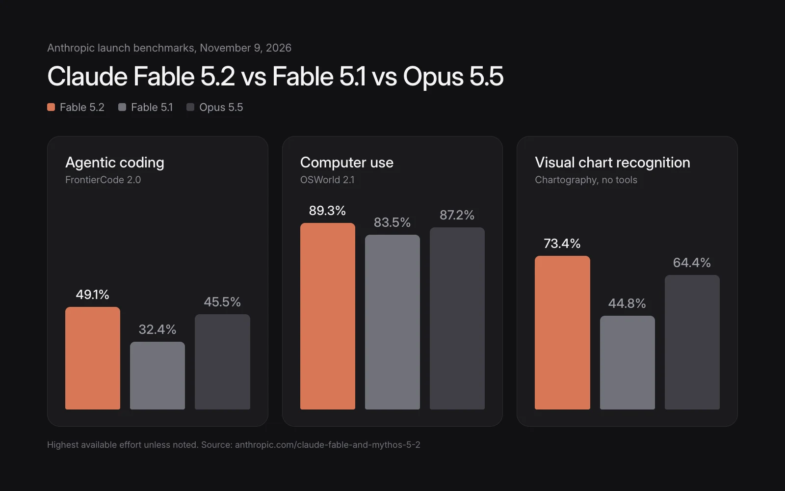
- Much better vision. On Anthropic's chart-reading benchmark (Chartography, no tools) Fable 5.2 scores 73.4%, up from 44.8% for Fable 5.1 and ahead of Opus 5.5 at 64.4%. Better visual reading is what lets a model compare a screenshot of its own UI against your reference and catch what is off.
- Stronger computer use. On OSWorld 2.1 it scores 89.3%, against 83.5% for Fable 5.1, which helps when it drives a browser to check its own pages.
- Better code, faster. It leads Anthropic's FrontierCode 2.0 table at 49.1% and generates output up to 30% faster than Fable 5.1.
- Lower price. $8 per million input tokens and $40 per million output tokens, about 20% less than Fable 5.1.
- Optional fast mode. Up to 2.5 times faster token generation for $16 and $80 per million tokens, handy for quick visual iterations.
- Fewer tokens at the default effort. On Medium, the default in Claude apps and Claude Code, Anthropic says it finishes hard tasks with fewer tokens than Fable 5.1.
Unity's early-access team called out one result that is directly relevant to designers: Fable 5.2 handled rebuilding an experience from a visual reference better than previous models.
Fable 5.2 pricing and speed
| Model | Input, per 1M tokens | Output, per 1M tokens | Speed |
|---|---|---|---|
| Fable 5.2 | $8 | $40 | Up to 30% faster than 5.1 |
| Fable 5.2 fast mode | $16 | $80 | Up to 2.5x token speed |
| Fable 5.1 | $10 | $50 | Baseline |
On subscriptions, Anthropic is giving eligible paid plans extra Fable usage during launch week, including one to three Fable usage resets depending on how long you have subscribed. Fast mode is available in Claude Code and on the Claude Platform, among others.
Test 1: a finance dashboard, compared with Fable 5.1
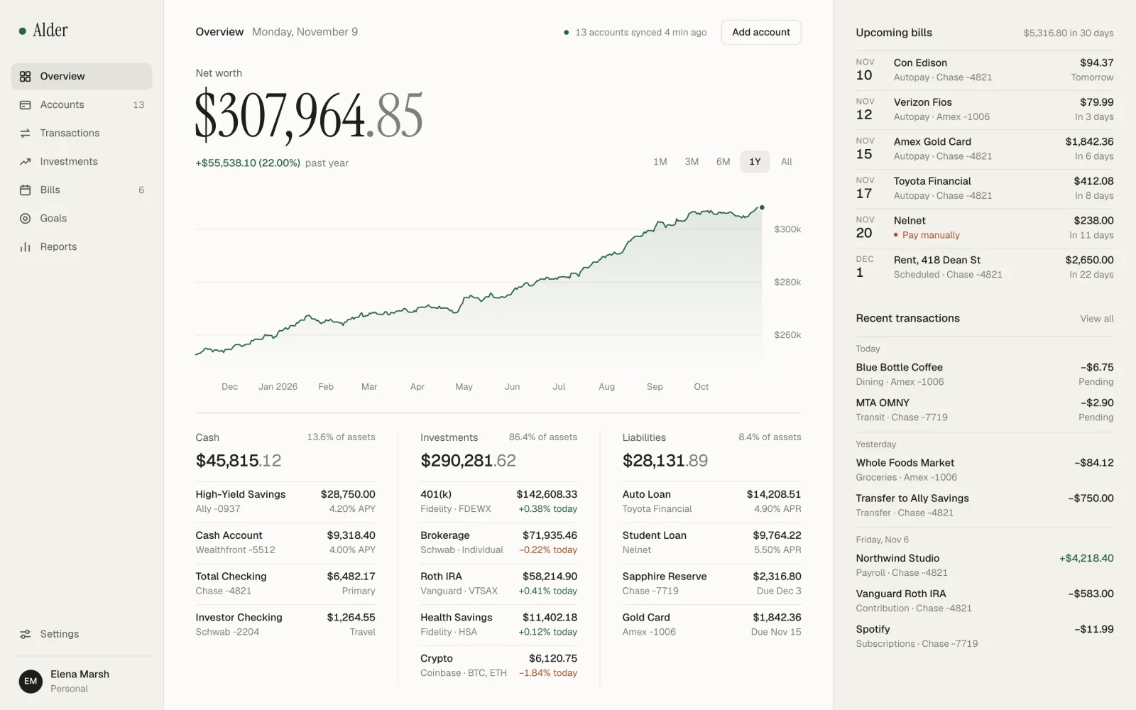
In September I tested Fable 5.1 on a premium personal finance dashboard with no references. I gave Fable 5.2 a matching brief in Claude Code: show net worth with a trend chart, cash, investments, liabilities, upcoming bills and recent transactions, keep a data-heavy screen calm, and check the result visually before finishing.
Design a premium desktop personal finance dashboard as a single self-contained index.html. No references: decide the visual direction yourself. It should show net worth with a trend chart, cash accounts, investments, liabilities, upcoming bills and recent transactions. Make a data-heavy product feel calm, with a clear reading order, controlled density and restrained color. Use realistic sample data. Target viewport 1440x900. When done, check the result visually and fix anything that looks off.
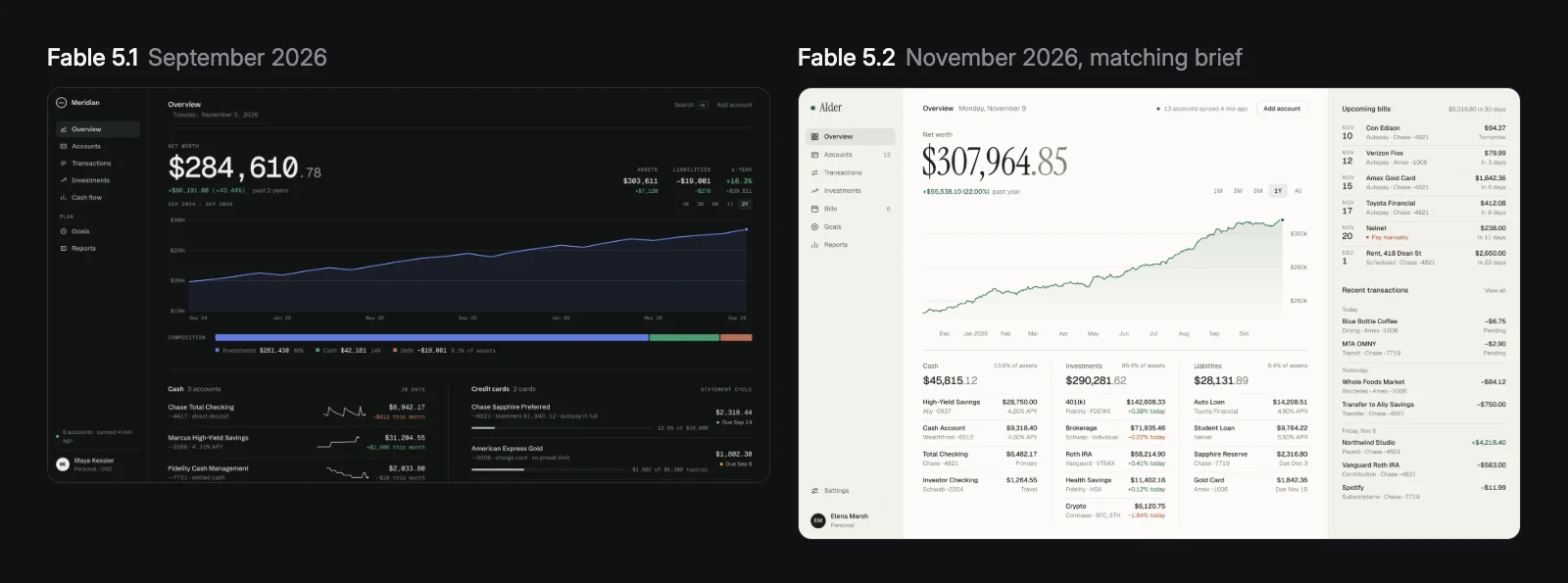
It finished in about five minutes. The result reads in a clear order: net worth and its chart first, then cash, investments and liabilities as three columns with share-of-assets labels, then bills and transactions in a right rail. Green is the only accent, and a rust color marks losses and the one bill that needs manual payment. Totals are computed from the sample balances, and the chart range tabs and tooltip work.
Compared with Fable 5.1, the biggest change is restraint. Fable 5.1 produced a strong dark dashboard, but Fable 5.2 used hairline rules instead of stacked cards, so there is far less visual noise around the numbers. The one flaw I found: the chart's x-axis drops the last month label because it sits too close to the edge.
Test 2: a landing page with a real art direction
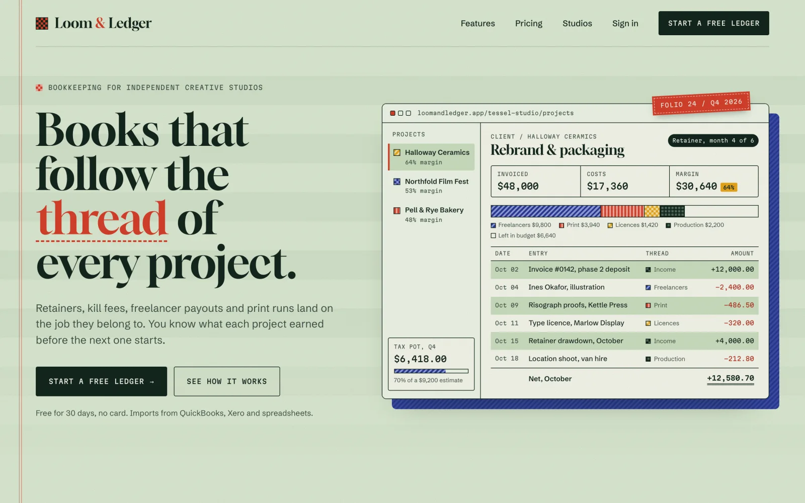
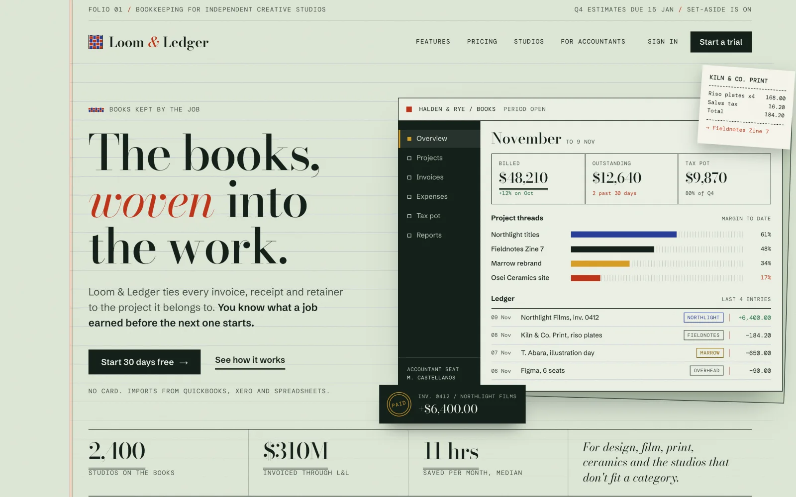
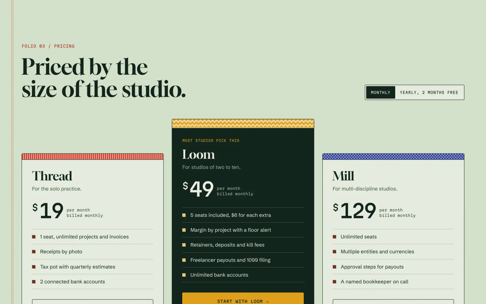
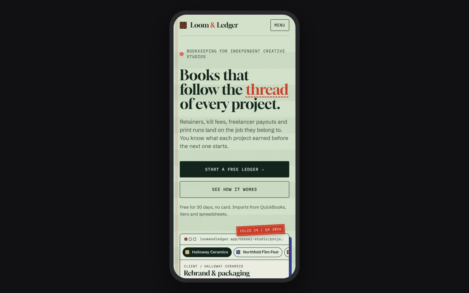
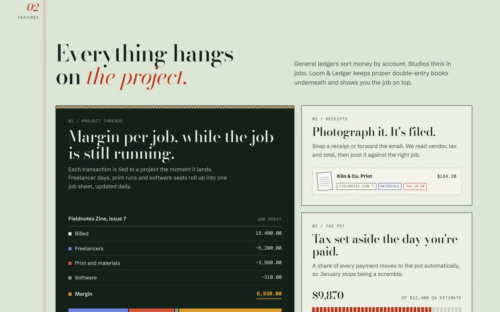
The second brief asked for a landing page for Loom & Ledger, a fictional bookkeeping app for creative studios, with a product mockup built in HTML and CSS, features, three pricing tiers, testimonials and a footer. I asked it to avoid the generic AI-made SaaS look and to check the page at 1440px and 390px.
I ran the brief in two sessions at once, and the two came back with different, equally committed directions. One treats the page like green-bar ledger paper crossed with a weaver's sample book, with a red margin rule, woven patterns that color-code categories, and an interactive project ledger in the hero where the totals are computed from the entries. The other leans editorial, with a high-contrast serif, a pinned receipt and a dark app sidebar.
Neither looks like a template. Both mockups are real HTML with working project switchers and pricing toggles, and the session that finished last listed what it fixed after its own visual check: lost side gutters, tiny price figures, a tag covering a date chip, truncated labels on mobile and a footer column orphaned on its own row.
Where Fable 5.2 still needs a designer
The results are strong first passes, not finished products. A few things I would still change by hand or with a follow-up prompt:
- Scroll-triggered content. Direction A hides its middle sections until they scroll into view. A full-page screenshot came out blank, which is also a risk for search engines and link previews.
- Invented proof. Direction B added stats like studio counts and money invoiced. That is fine for a mockup, but every number needs replacing before anything ships.
- Small chart details. The dashboard's missing month label is the kind of edge case it noticed and chose to leave.
- Heavy monospace. Both landing pages lean on monospace labels for character. It suits a ledger theme, but I would dial it back for readability.
None of these are structural problems. They are the last 10% that a designer catches in review, and Fable 5.2 fixes them quickly once you name them.
Fable 5.2 vs Opus 5.5 for UI design
Anthropic recommends Opus 5.5 as the daily driver and Fable 5.2 for the most ambitious, open-ended work. On FrontierCode 2.0, Fable 5.2 at High effort roughly matched Opus 5.5 at Max for about half the cost per task, so moving up is not as expensive as it sounds. For design work, this is how I would split it:
How to get better UI from Fable 5.2
- 01Select the modelIn Claude Code use /model and pick Fable 5.2, or pass claude-fable-5-2 on the API. Update Claude Code first if the model is missing.
- 02Raise effort for direction-settingMedium is the default. Use High for a first visual direction and stay on Medium for edits.
- 03Give it a point of viewName the product, the audience and what to avoid, like a generic AI-made SaaS look. With its stronger vision, a screenshot of a site you like beats a paragraph of adjectives.
- 04Ask it to check its own workEnd the prompt with a request to screenshot the result at your target widths and fix what looks off. Both of my tests caught real layout bugs this way.
For more prompt patterns that still apply, see my guide to getting beautiful output from Fable 5: Claude Fable 5 for UI Design: Beautiful Output Every Time
FAQ
Anthropic released Claude Fable 5.2 and Claude Mythos 5.2 on November 9, 2026.
On the API it costs $8 per million input tokens and $40 per million output tokens. Fast mode costs $16 and $80. It is also included on paid Claude plans, with extra Fable usage during launch week.
Yes. In my launch-day tests it produced a restrained finance dashboard and two distinct landing page directions, and it caught and fixed its own layout bugs after checking the pages in a browser. It still benefits from a designer's review.
On Anthropic's benchmarks it is ahead on almost everything, including visual chart reading (73.4% vs 64.4%). Anthropic still recommends Opus 5.5 as the default and Fable 5.2 for more ambitious work.
They are the same model. Fable 5.2 has extra cybersecurity and biology safeguards and is available to everyone, while Mythos 5.2 is for vetted organizations.
claude-fable-5-2.