MyAryaka Design System
Design Systems, UX Design
2024
Background
When I joined Aryaka Networks as one of two UX Designers, I quickly recognized an opportunity to improve the design process for MyAryaka, our network management and analytics portal.
At the time, the design workflow relied heavily on copying and modifying UI components from previous designs, which led to inconsistencies, inefficiencies, and challenges in collaboration between designers and developers. To address these issues, I lead the creation of a scalable and centralized design system that would serve as the backbone of our design process.
The problem
When I first joined Aryaka, there was only one other UX Designer who handled the end-to-end design process for MyAryaka, our networking management and analytics portal. However, this process consisted of copying UI components from previous designs to new designs without a central library to act as a single source of components, patterns, and styles. This process exhibited some clear shortcomings, most notably:
Design Inconsistencies: With no established system to define when and how components are used, designs showed unintentional variations from project to project, which often ended up in production
Inefficiency: Time was wasted searching for components from old designs and increased our design debt as the product grew
Weak Collaboration with Developers: Developers were left with misinterpretations of how components should look or behave, leading to misaligned expectations and extra revisions

The process
I had a clear vision for how I could transform our design process from messy and unscalable to consistent and efficient, leading to higher satisfaction for the designers, developers, and ultimately the end user.
Don’t reinvent the wheel
I was mindful of a key principle in UX design: the thing that you’re designing has probably already been designed well by someone else. This is especially true in the context of design systems, with companies like Google, Shopify, Atlassian and many more offering fantastic design systems to learn from. To avoid reinventing the wheel, I took inspiration from many aspects of them regarding documentation, accessibility, and overall design system structure.
Audit and Analysis
I started by conducting a comprehensive audit of MyAryaka and the existing Figma designs to catalog all UI components, patterns, and styles currently in use. This step also reinforced my understanding for why and how components were currently used.
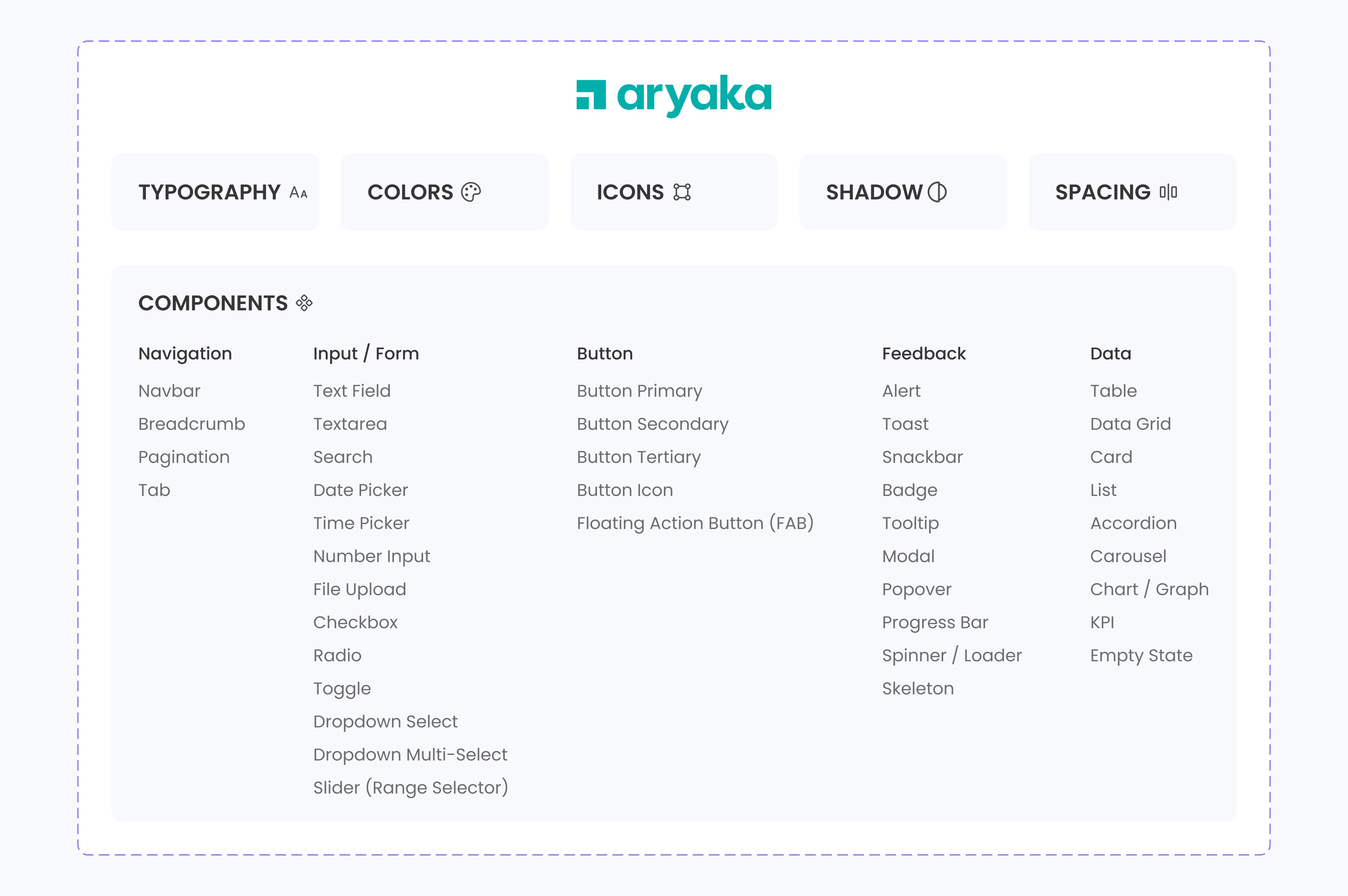
Laying the Foundations
The new design system began with defining the core foundations of any UI element: typography, color, spacing and shadow. I documented and organized the currently used foundations of MyAryaka and created a styles system defining each text style, color, spacing and shadow value, along with how they were used.

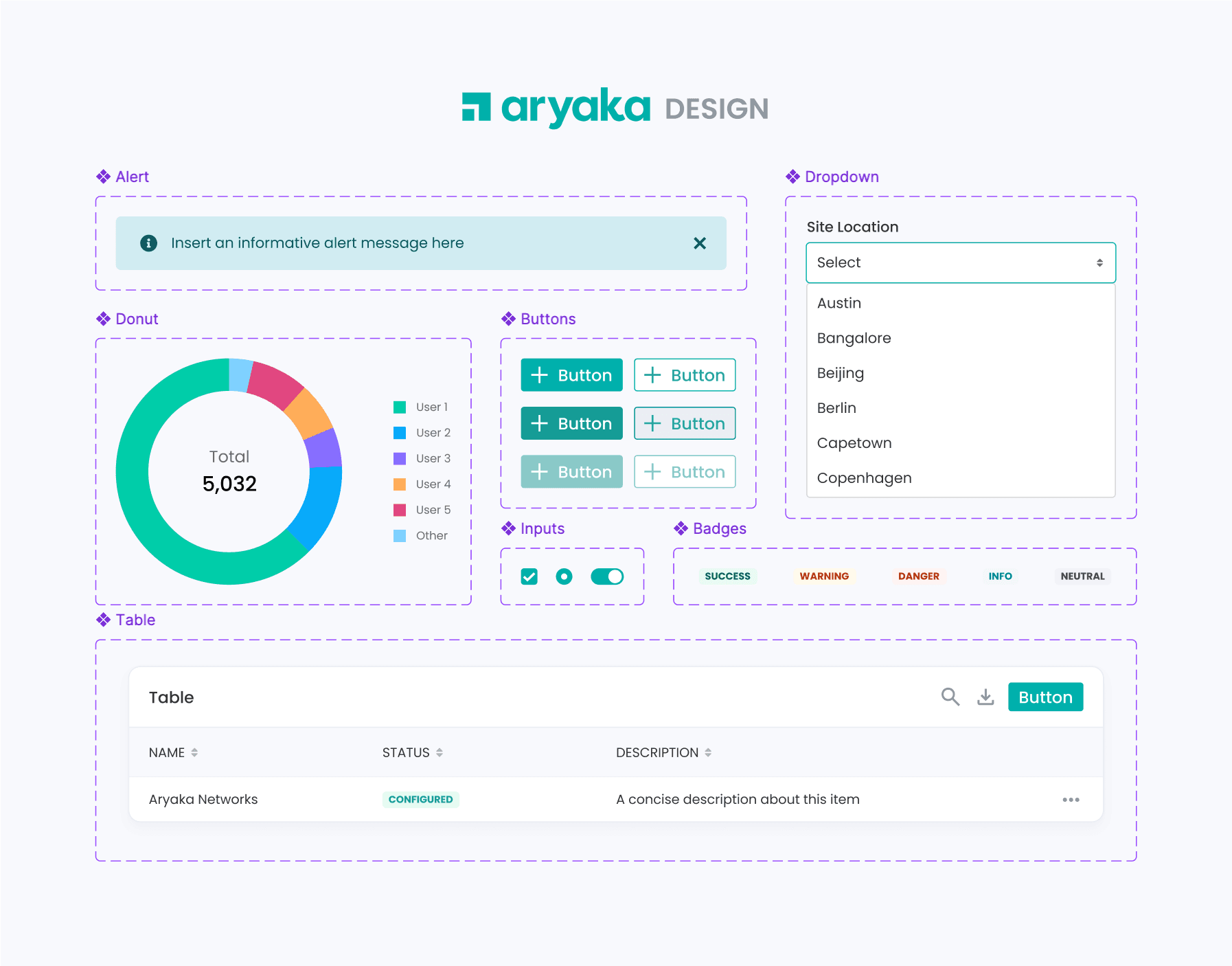
Establishing a Centralized Component Library
I dedicated a page in our new Figma design system that acted as the single source of truth for all reusable components.
Here's an interactive preview of it:
Enabling rapid and flexible design
I applied Figma Auto Layout wherever I could to make our components flexible and responsive, letting us create layouts that replicate CSS by adjusting seamlessly to different screen sizes and layouts.
Combining similar components into variants was also essential to streamline our design process by allowing quick changes to properties of components like states, sizes, and styles, reducing the number of necessary components.


The impact
We saw a clear jump in the speed and quality of our design processes upon adoption of the new MyAryaka Design System, and improved our product’s user experience as features were implemented consistently and accurately. Collaboration between the design and development teams immediately led to greater productivity and reduced miscommunication. It also helped our recently-hired designer quickly understand how we design, and will serve the same role for all future team members that need a clear understanding of how MyAryaka is designed.

Next steps
Insights into UI fixes
Thoroughly auditing our existing UI components and patterns helped me pinpoint what parts of our product needed fixing. I took note of UI bugs that it suffered from such as improper responsiveness, lack of visual feedback, styling inconsistencies. The length of this list turned out too long to ignore; moving forward, I’ll be working with the lead designer and developers to resolve these issues to make for a more usable product.
Evolving with the product
Although the first version of our design system is complete, the work isn’t finished. As our product evolves, the design system will need to as well so that it isn’t restrictive. There will be instances moving forward where new design solutions will be required and existing ones will need changing. As the design system grows, the most important thing is that it continues to provide value to the design and development processes.
