UX Design
2021
Project info
Overview
For the final project of my UC Davis UI/UX Design class, I designed a mobile app that helps gig workers at companies like Doordash and Uber Eats better understand their earnings and costs. As a gig worker who drives for multiple companies, I had a clear vision for how an app could unify important data such as earnings and mileage into one interactive dashboard.
Problem Statement
Gig apps like Doordash, Uber Eats and Instacart offer appealing perks like working flexible hours and being your own boss. However, gig workers who drive for multiple apps face a clear problem: calculating earnings across apps is a tedious, manual process. When accounting for personal expenses like gas and repairs, it gets even more difficult to determine net income from gig work.
User research
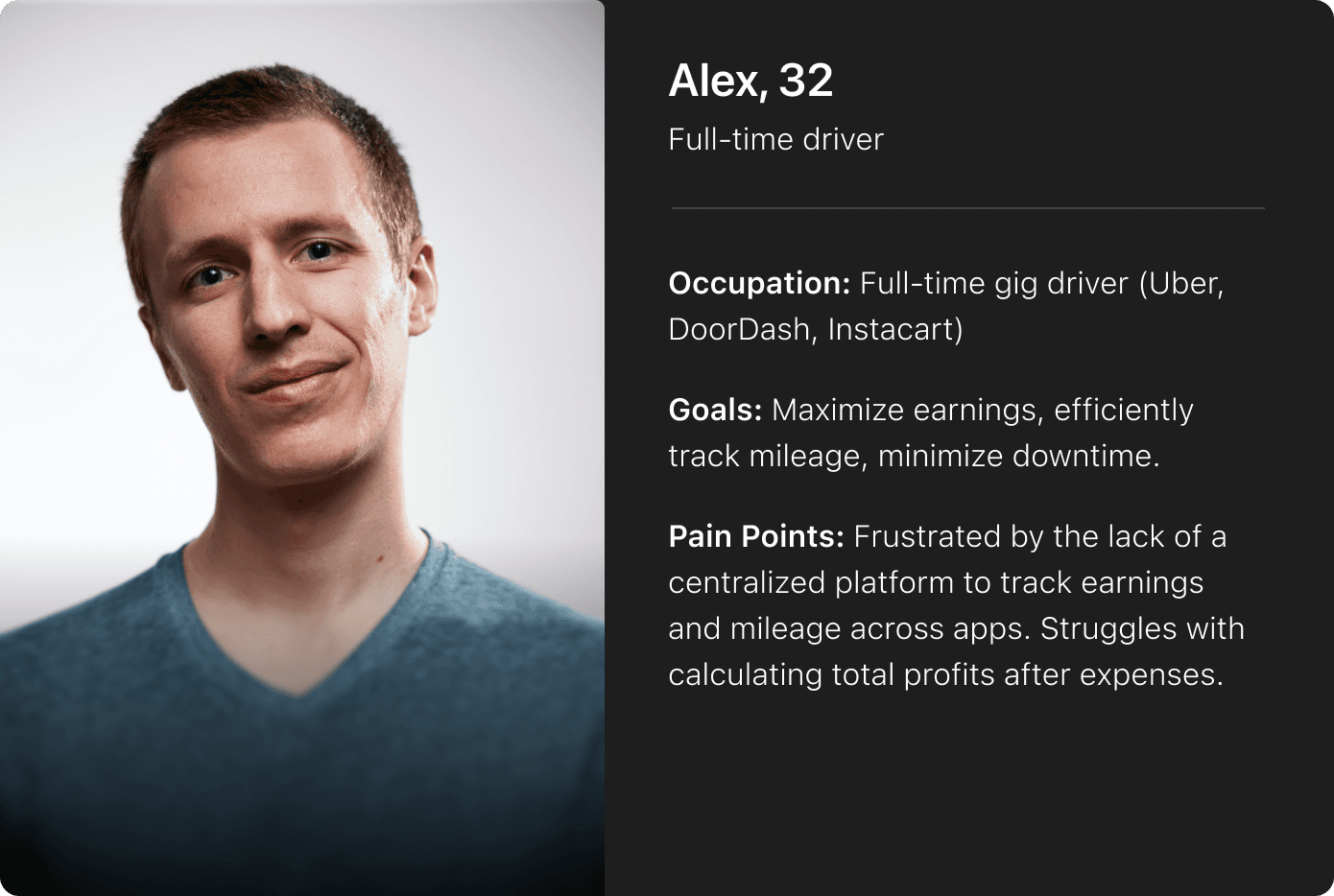
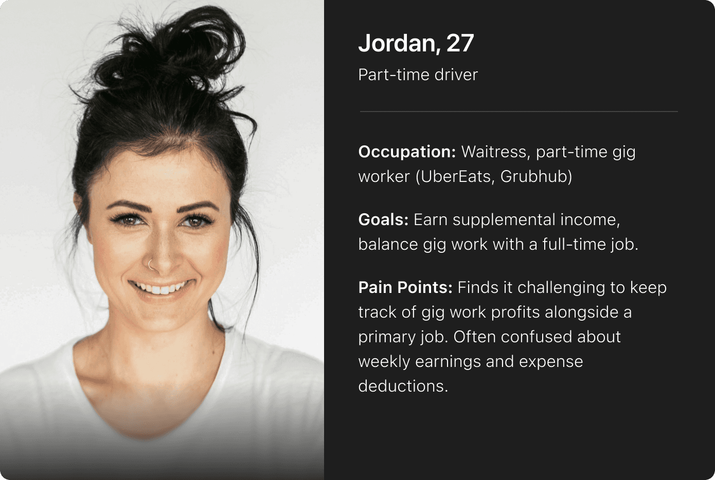
For my research, I conducted five user interviews with full-time gig workers, created user personas, and read online anecdotal reviews about gig workers’ experiences with various gig apps. Overall, I found that users saw many shortcomings among these apps, some of which were related to a lack of earnings analytics. Other concerns were about bugs/glitches, low earnings, difficult pickups at certain restaurants, and more.
Something that stood out to me was when one of my interviewees mentioned that he often had very slow or even completely dead hours/days, making him wish he could figure out what his highest performing hours/days are. He also mentioned that he often finds himself having to use the Calculator app on his iPhone to find out how much he made per hour in a night and to get a sense of how he had performed compared to other nights.
My research uncovered two major pain points:
There’s no way to view total mileage driven on any major gig app for tax purposes
Certain hours and days are very slow for receiving orders
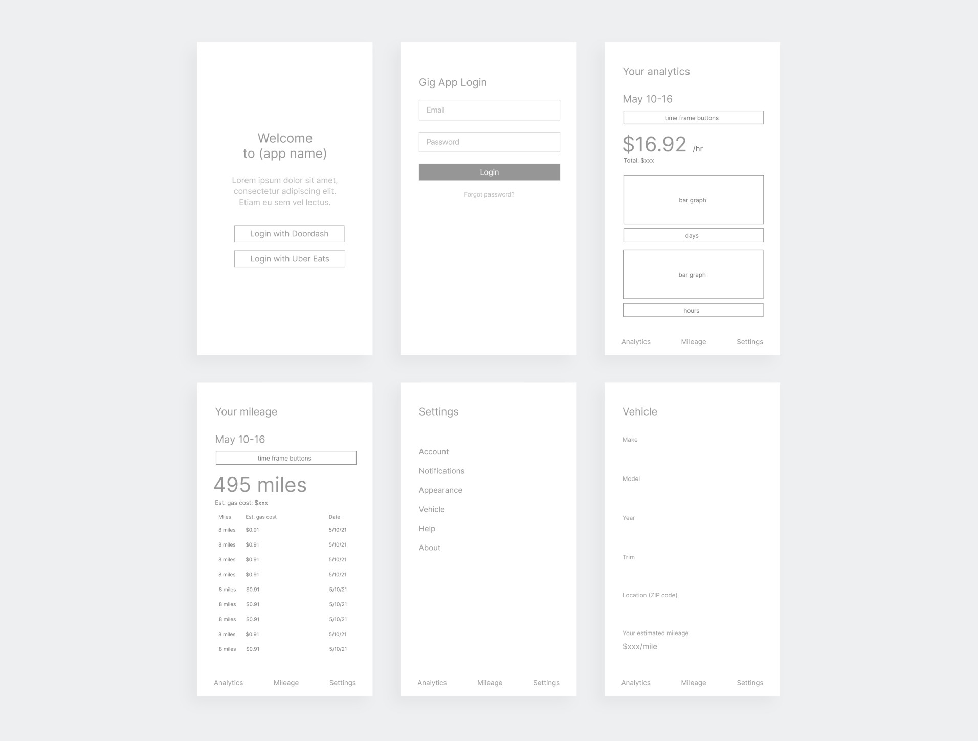
Low-fidelity wireframes
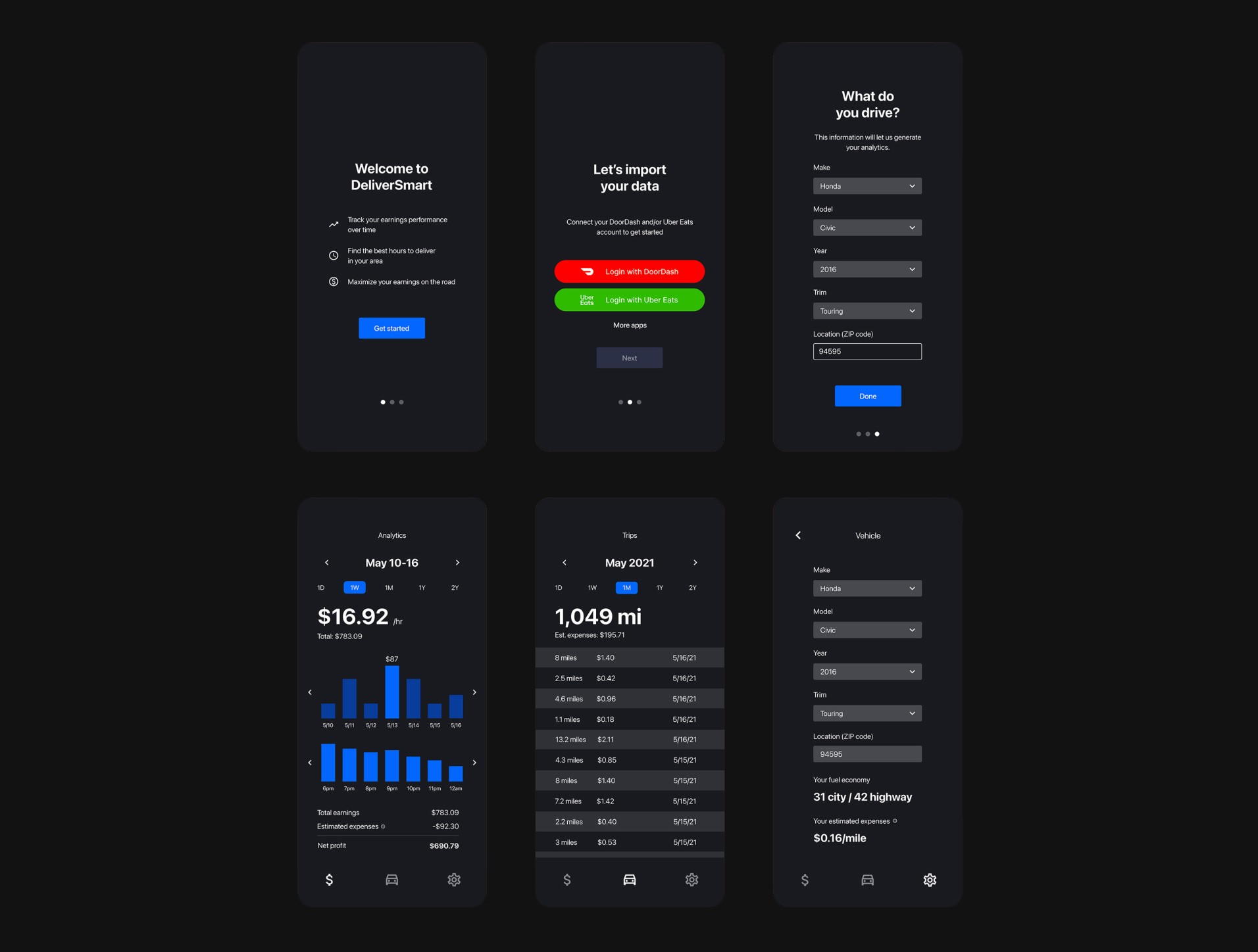
I began my design process by creating a skeleton of the application’s main pages to establish their layouts. During my research, users indicated that Earnings Per Hour would be one of the most important features for them in my app, so I made it the most prominent element on the Analytics page. Similarly, I made Total Miles Driven the most prominent element on the Mileage page.
High-fidelity mockups
For the high-fidelity prototypes, my main focus was maintaining a consistent visual design across the entire app. Because I wasn’t working with any premade design system or library (other than iconography), this was challenging when visualizing different types of information such as earnings analytics vs. mileage. Continuously testing with my users and collecting feedback was integral to my design process.
Initially designed with an optional dark mode feature, user feedback revealed that most gig workers prefer dark mode whenever available in other apps. As a result, I made dark mode the default setting for improved readability during nighttime shifts.
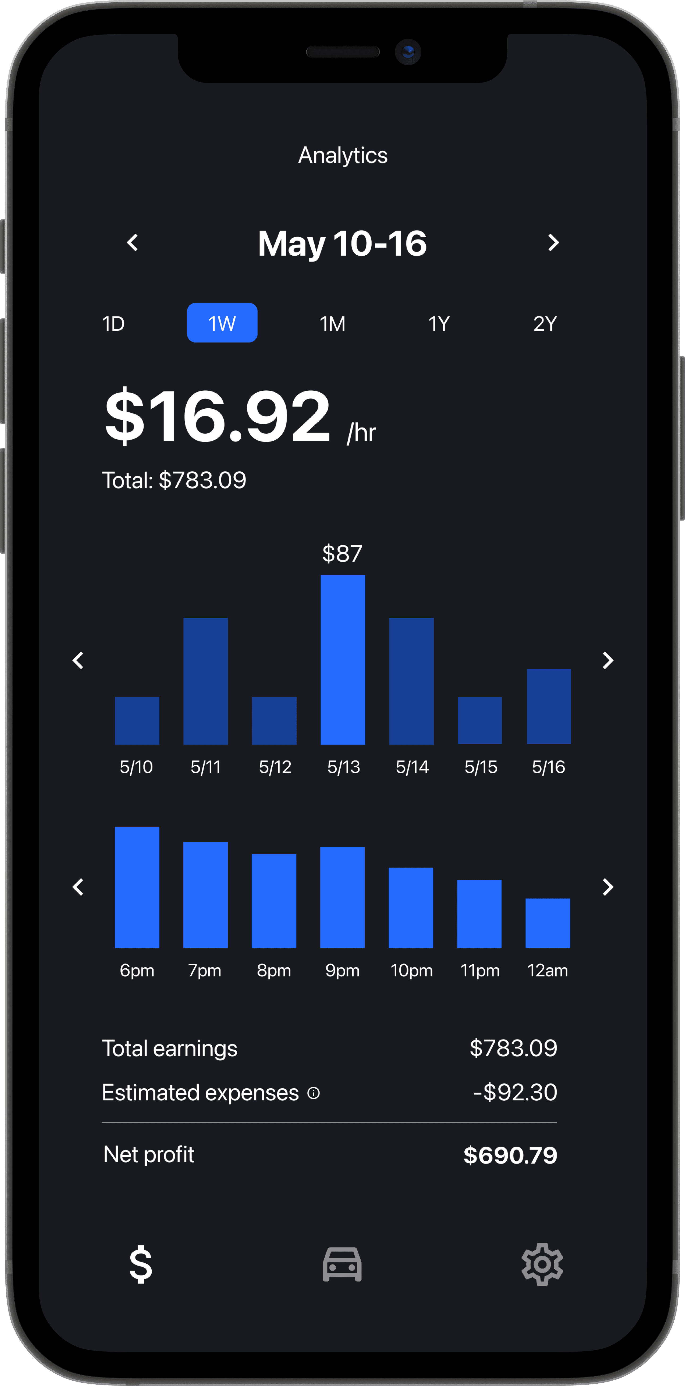
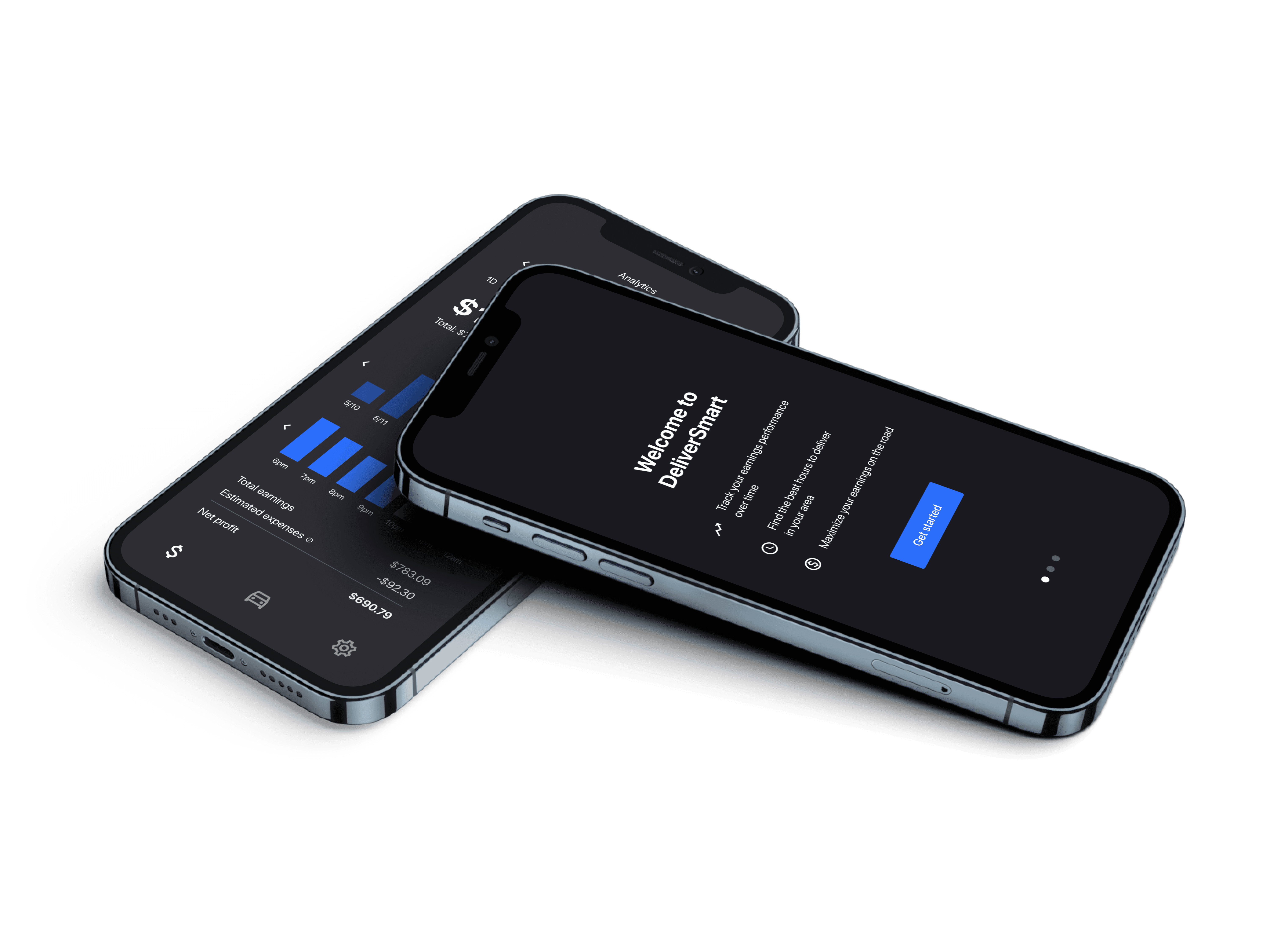
Analytics
The Analytics screen was designed to provide gig workers with clear insights into their performance across multiple platforms. It features real-time visualizations of detailed metrics such as earnings per hour and total earnings, with the ability to drill down into particular days. I prioritized clarity and usability by leveraging simple bar charts, making it easy for users to compare their progress week over week.
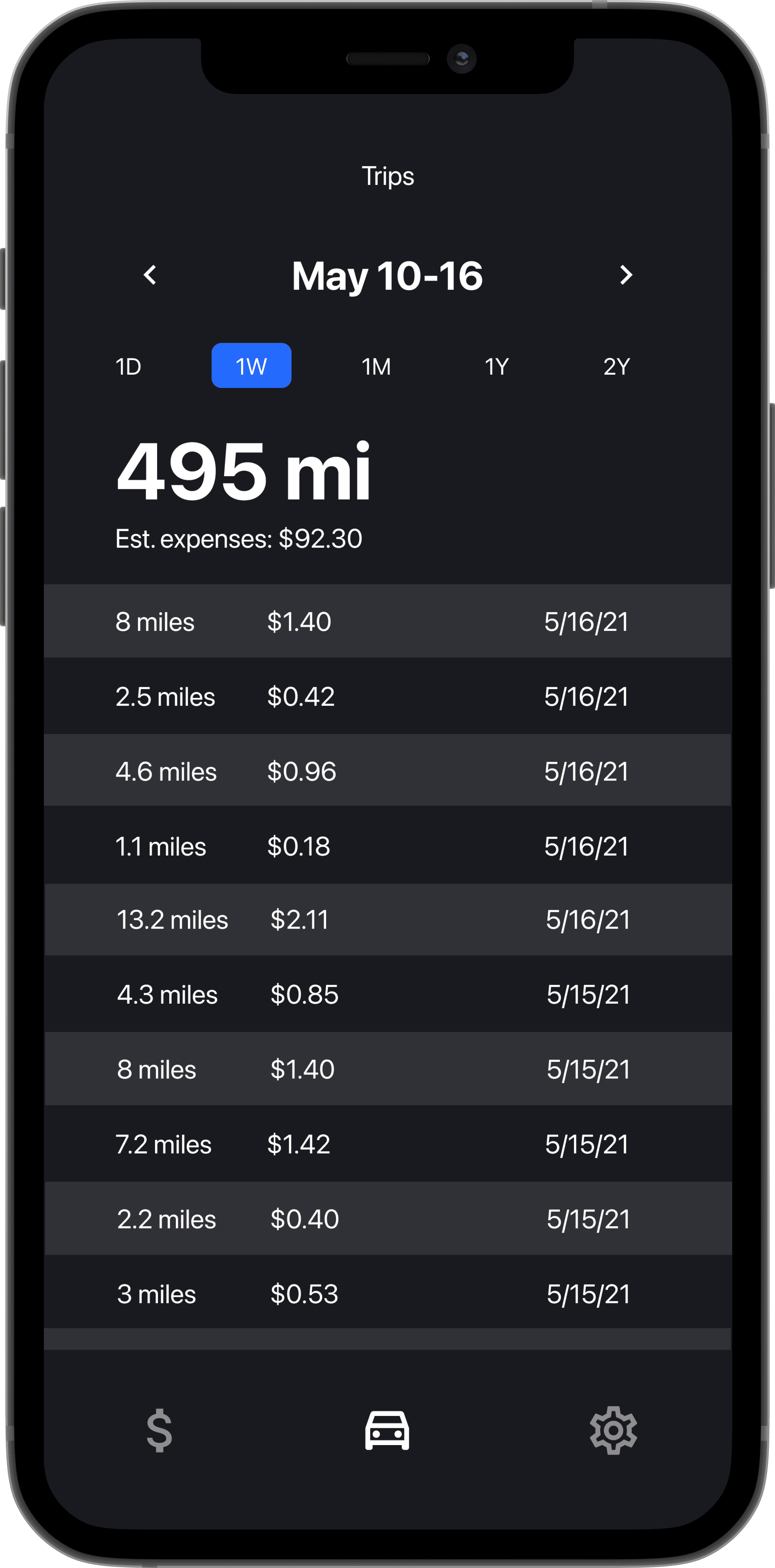
Trips
DeliverSmart imports mileage data from whichever delivery apps the user links, whether that’s Doordash, Uber Eats or both. Neither the Doordash app nor the Uber Eats app shows all of a driver’s mileage data in one place, so this is one of the advantages of the Trips screen in DeliverSmart. This data can be particularly useful for understanding how much of a driver’s mileage is business-related so that it can be written off for tax purposes.
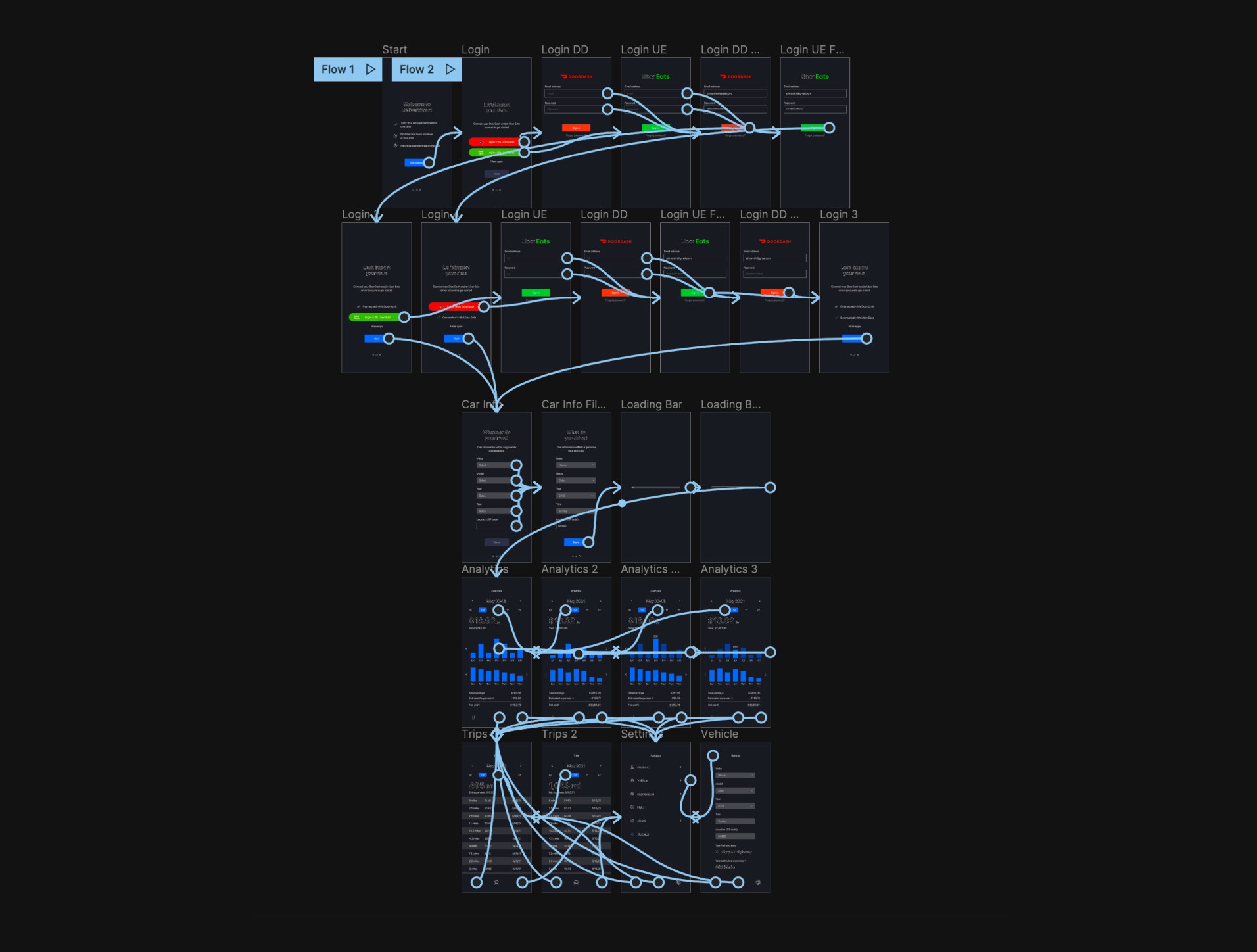
Prototyping
The next step was building an interactive prototype using Figma’s prototyping tool. This allowed me to conduct usability testing with my pool of test users. Try it out yourself here!
Impact
My app design concept demonstrated the potential to significantly improve how gig workers manage their earnings and mileage across multiple platforms. Through user testing and feedback on high-fidelity prototypes, gig workers expressed that the centralized dashboard would have saved them considerable time by automating manual calculations and providing real-time insights into net income after expenses. The design showcased how clear visualizations and automated tracking could empower users to make smarter decisions about their schedules and optimize their driving strategies. DeliverSmart proved that with the right design approach, managing gig work finances could be far more intuitive and efficient.

Takeaways
DeliverSmart was my first time working on a mobile app, and also my first time conducting user testing which gave me highly valuable insight into the most important aspect of designing a user experience: understanding how users interact with your product. Having switched from Adobe XD to Figma shortly before this project, it gave me lots of time to get familiar with the design software and its variety of features.