UX Design + Web Development
2022

Project info
Overview
MarkLogic is an enterprise software company that develops and provides a NoSQL database, helping its customers simplify their data integration.
I was hired by MarkLogic as a User Experience Design intern in February 2022. For the first project at my MarkLogic internship, I was assigned the redesign of the Administrator User Interface (aka Admin UI), the browser-based tool for configuring the MarkLogic Server product.
Problem Statement
While there are other ways to configure MarkLogic Server, through scripting languages such as JavaScript or XQuery for example, the Admin UI is the only graphical route to configuring it. Up until this redesign project, the Admin UI hadn’t been visually updated since its creation over a decade ago. Its design was heavily outdated, and developers found it ugly and displeasing to use.
Before redesign

User research
The UX team conducted user research within the company, interviewing developers that had worked with Admin UI for several years. After conducting a discussion to get their feedback, common themes included:
Styling adjustments
Layout rearrangements
Color/contrast changes
Overall, the developers believed that a solely visual update (rather than adding or changing any functionality) would positively impact their everyday experiences with this essential MarkLogic product.
MarkLogic Design System
Since the creation of the Admin UI, MarkLogic has developed a sophisticated and cohesive design system that I used for this project. This design system was essential for establishing consistent styling for various components such as buttons, icons and colors across the Admin UI.
This was my first time working with a design system, and I found that not having to tedious make decisions about how each individual UI element will look made the design process smoother and helped my team produce a beautiful and usable final product.
Redesigned screens
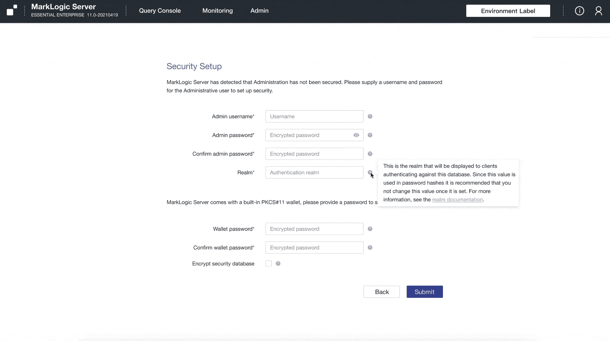
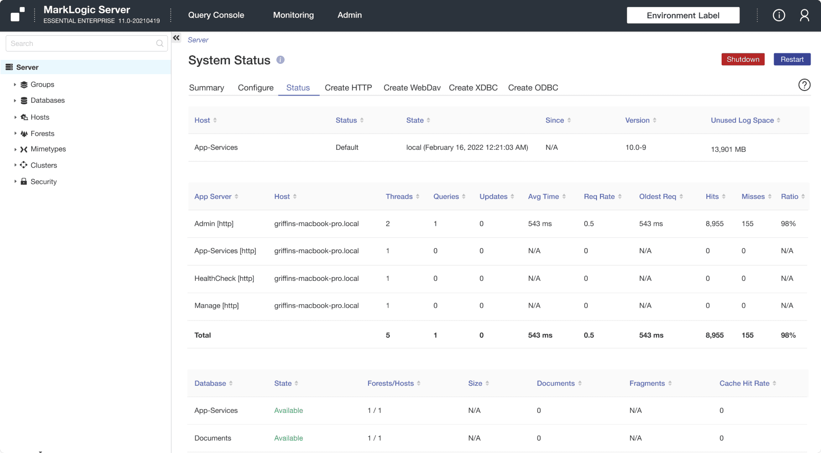
I was tasked with redesigning the Initial Setup and System Status screens while the Lead UX Designer redesigned the other screens.
Our main goal for the new Initial Setup screens was to give the user an easy, seamless setup process and a positive first impression of the dashboard.
Implementation
After finalizing the redesigned dashboard in Figma, the next step was implementing it.
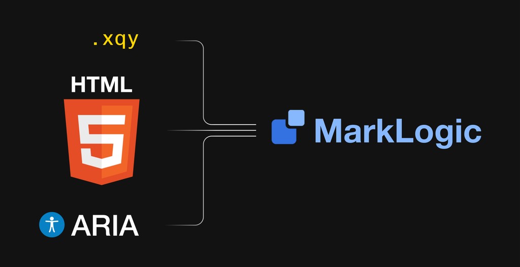
Since this was a visual redesign project, a good chunk of the development process was updating the CSS styling. However, most of the process involved updating the XQuery code that generates the Admin UI pages.
Much of the Admin UI was originally coded using outdated and/or inefficient web design practices, such as using images to display buttons and using HTML tables for layout. In order to update styling and make future code changes less tedious, I updated thousands of lines of the XQuery code as well as the CSS to reflect the redesign as accurately as possible.
508 Compliance
Section 508 of the Rehabilitation Act requires that all electronic and information technology used by the federal government be accessible to people with disabilities. Since Admin UI is used by government employees, I was tasked with making it fully accessible.
Admin UI has a lot of features and functionality, but it was not designed with accessibility in mind. People with disabilities, such as low-vision/blind users, were not able to access all the information and functionality of the dashboard.
After receiving a full accessibility audit from an agency specializing in 508 compliance, my main tasks to make Admin UI more accessible included adding:
Keyboard Accessibility: The dashboard should be navigable with keyboard-only input, allowing users with motor impairments to access all the functionality of the dashboard.
Semantic HTML: Elements such as <header>, <section>, and <footer> convey the structure and meaning of the content to assistive technologies.
ARIA Labels: ARIA (Accessible Rich Internet Applications) labels needed to be added to interactive elements, such as buttons and links, to help screen readers provide information to users who are low-vision/blind.
Form Labels: All form fields needed clear labeling to make it easier for users who use screen readers to understand the purpose of each field.
By restructuring Admin UI’s HTML with accessibility in mind, it has now reached AA level compliance by WCAG standards, and I was able to improve the user experience for all users and make the dashboard more usable and inclusive.
Takeaways
I gained an incredible amount of real-world experience and knowledge working on this redesign project. I learned how to work on a multidisciplinary team of designers, engineers, and managers. Communication was a key part of making this redesign successful. Keeping an open mind to my teammates’ ideas and criticisms helped me become a better team player and a better UX designer overall.
Understanding how to design under technical constraints was something that was unfamiliar to me at the beginning of this project, but playing a developer role helped me get a feel for what aspects of my designs were feasible to implement and which ones weren’t.
Prior to this project, I had minimal HTML and CSS experience, but the many hours that I spent working in these languages has given me a lot of skill and confidence in a front-end development setting. On top of that, learning how to use Sourcetree and Bitbucket has given me a solid understanding for how Git and version control works.