
Overview
#ad: this post and the video are sponsored by Mobbin. The tests, picks and opinions are my own.
You can spot an AI-designed screen from across the room. The spacing is close but not right, the components look like every template, and every landing page has the same split hero and the same three cards. It works, and it looks like everyone else's.
Claude Fable 5.2 is Anthropic's best model yet for building interfaces, so I wanted to see whether it has fixed that on its own. Short answer: not quite. On four briefs, Fable 5.2 alone made clean, usable screens that still looked like AI. Connected to Mobbin through MCP, so it could research real apps before designing, it made work I would put my name on. Every change came with a note naming the real app it came from.
Here is the whole test, the prompts that made the difference, and what I would tell anyone who designs with AI.
Why does AI-generated UI look generic?
A model with no references designs from the average of everything it has seen. Ask for a finance home screen and you get the most common finance home screen: a balance card, a row of stats, a transaction list. Ask for a landing page and you get a split hero, a feature grid and a pricing table. Nothing is wrong with any of it. It is just the median.
Real products don't look like the median because real teams made specific choices for specific users. Monzo, Copilot and Starbucks each solved the same problems differently. When the model can see those choices, it has something better to draw from than its own average.
That is what this test checks: same model, same briefs, with and without real references.
The setup: Fable 5.2 plus Mobbin over MCP
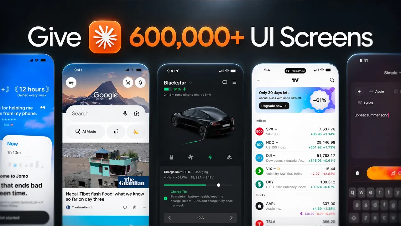
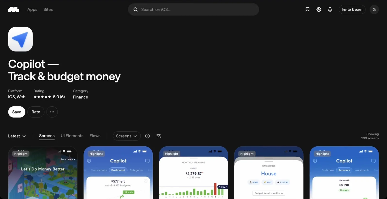
Mobbin is a library of 600,000+ screens and flows from apps and websites people use every day. You can search by app, by screen type or by pattern. Search "budget" and you get Copilot, Monarch and every screen they have shipped.
When I pick references myself, I skip the prettiest screen. I look for apps solving the same problem for the same kind of user, then go a few screens deep, because the home screen is always the most polished part. Flows matter most for onboarding and checkout: they show every step in order, including the error and confirmation screens AI usually skips.
The Mobbin connector (an MCP server) lets Claude run those searches itself and pull real screens into the conversation. The MCP is a paid feature. If you want to try it, my link gets you 20% off a paid plan:  Mobbin
For each brief I ran the same four steps:
- Baseline: Fable 5.2 with no references.
- Research: Fable searches Mobbin and explains what it takes from each app.
- Build: the same brief again, designed from those references.
- Compare: both versions side by side.
Test 1: Penny, a personal finance home screen
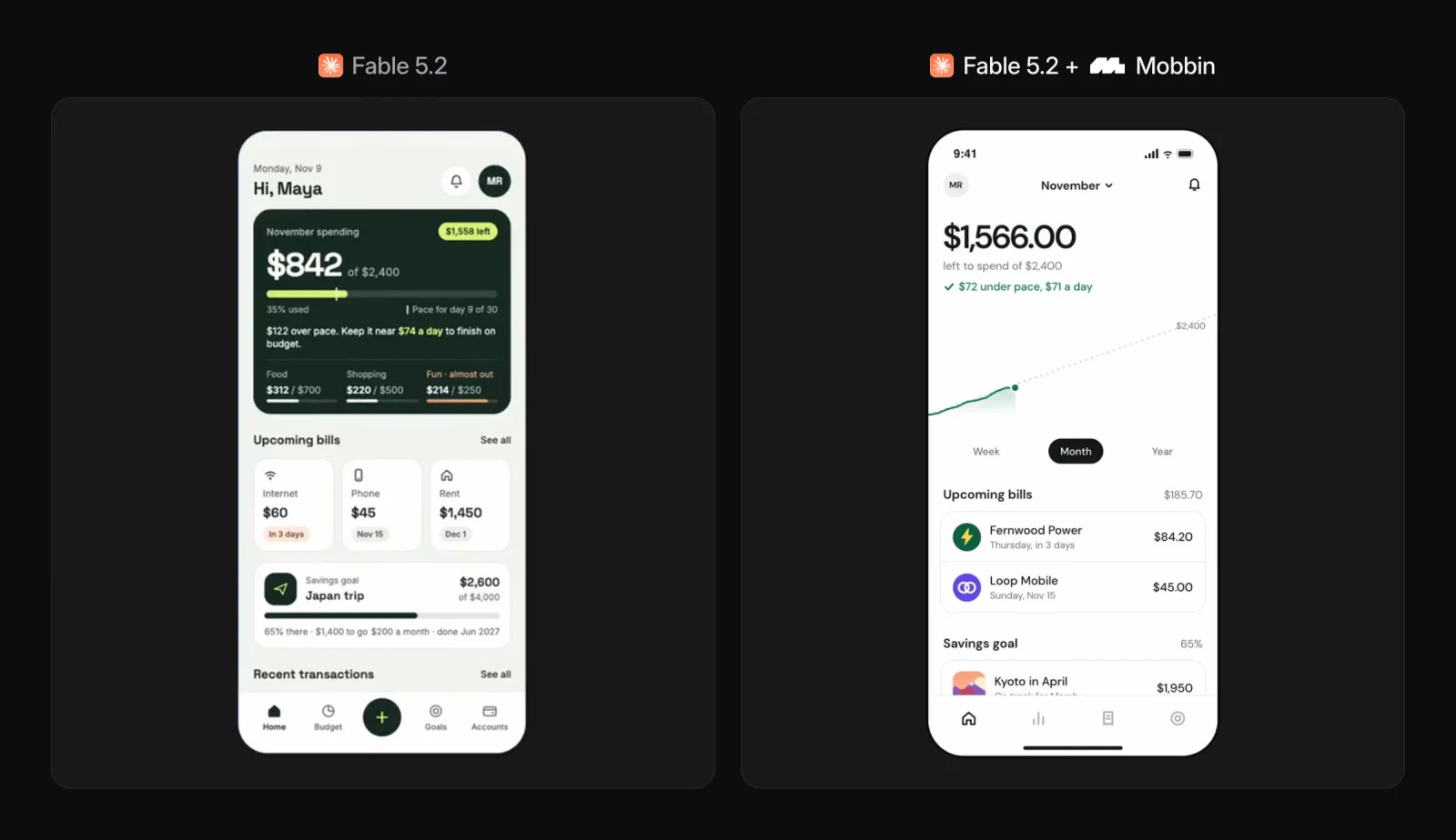
The brief: design the home screen for Penny with this month's spending against budget, upcoming bills, recent transactions and a savings goal.
On its own, Fable made something clean and not bad at all. It also looks exactly like AI: a big green balance card, a grid of stats, a layout we have all seen before.
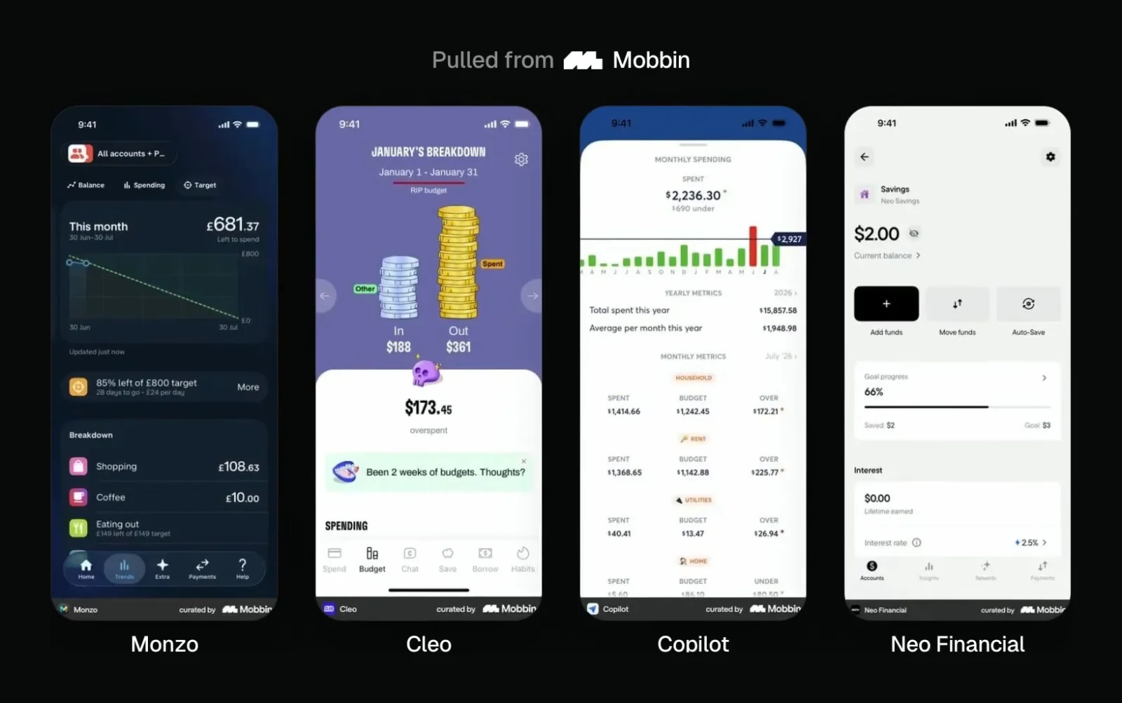
With Mobbin connected, I asked it to research how real finance apps design their home screen, pick the three or four strongest and tell me what it was taking from each. It chose Monzo, Cleo, Copilot and Neo Financial.
The first pass still felt a little generic, so I sent one follow-up. This is the prompt I use most with the Mobbin connector:
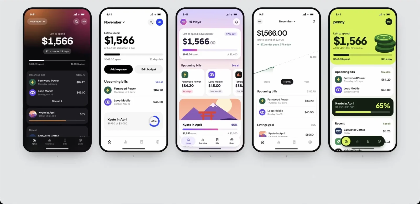
Look at the actual screenshots of those apps and get closer to how they really look. Give me five original directions.
Even with references, the first result is rarely the one. Five directions let me pick instead of rewrite. I went with the fourth: the chart is the picture. One big number, a single pace line showing spending against budget the way investing apps chart a portfolio, and just two upcoming bills with real merchant logos. Fable noted that every finance app it studied keeps the screen to one number, three type sizes and short lists.
Test 2: Relay, a SaaS landing page
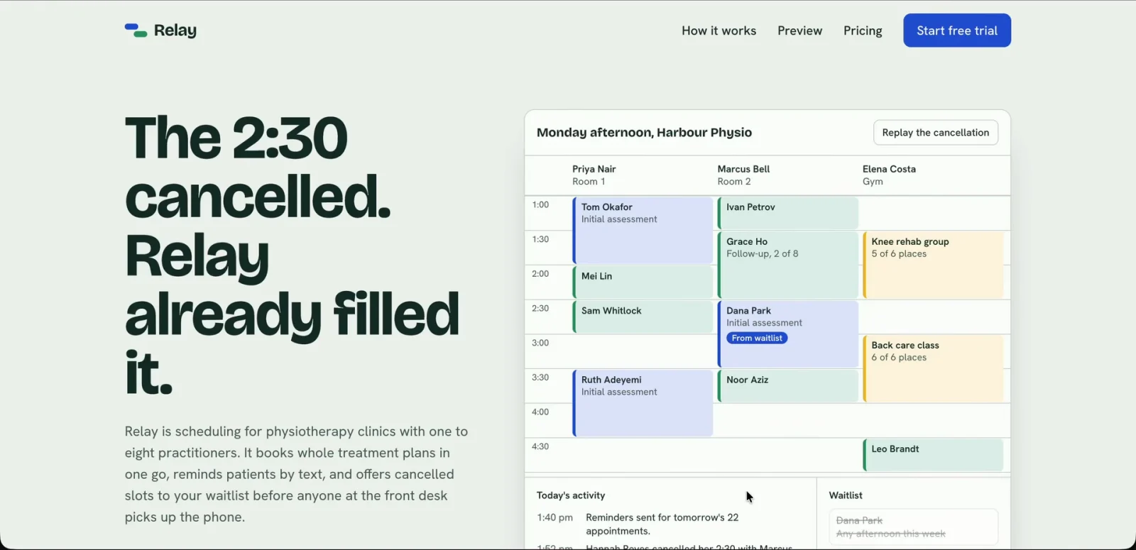
The brief: a landing page for Relay, a scheduling tool for physio clinics, with a hero, how it works, a product preview, pricing and a call to action.
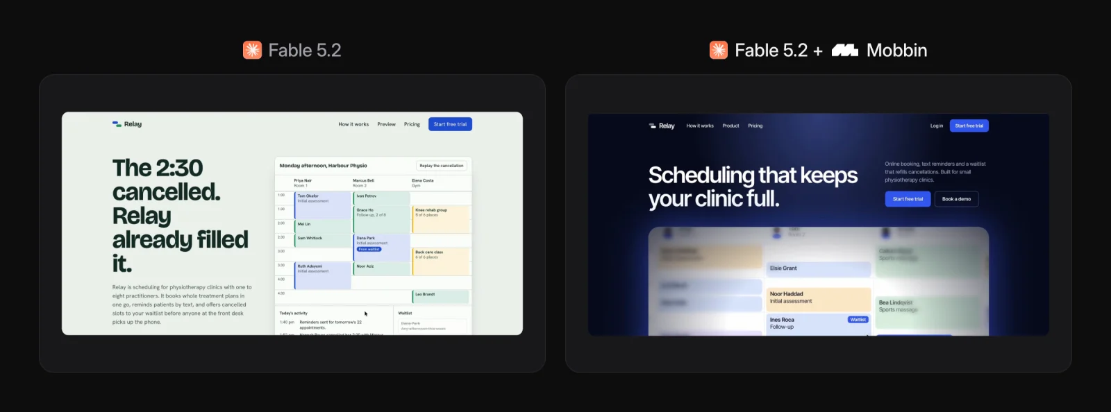
Without references, Fable went for a split hero with a calendar on the right and a standard stack of sections. It works. It also feels like a template.
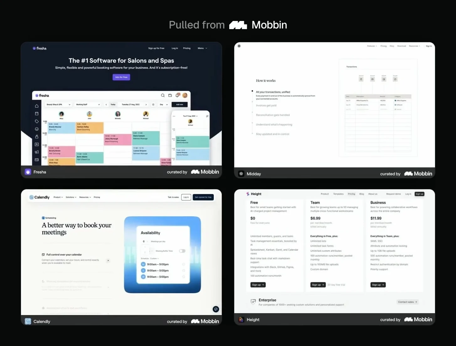
With Mobbin, it researched Fresha, Midday, Calendly and Height. Its note on Fresha stuck with me: the headline should be modest so the product does the selling. Most AI landing pages get that backwards.
I asked it to study the biggest booking sites, Calendly, Cal.com and Zocdoc, and give me five directions. I liked the cobalt one, asked for three more cinematic takes on it, then combined the layout of one with the colors of another.
The final page has a near-black navy hero lit by one cobalt beam, with the real calendar glowing in the middle. Each of the three steps is a tall dark tile with a big number over a real piece of the product, the way Flora shows its interface. Pricing follows Dovetail: one big price for the recommended plan, with the others as a short list. The closing section mirrors the hero, so the page starts and ends on the clinic's schedule, with one slot still open.
Test 3: Stillwater, a sleep app onboarding flow
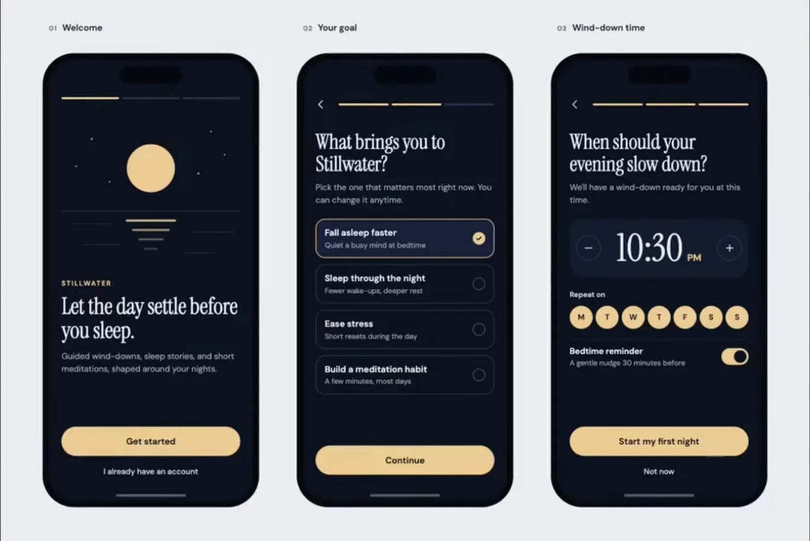
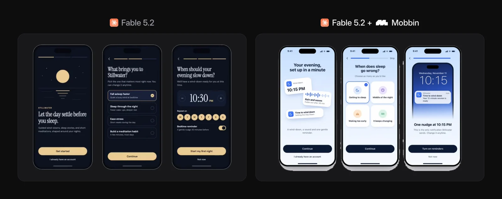
The brief: a three-screen onboarding flow for Stillwater, a sleep and meditation app. The plain version is nice to look at, but it's a standard welcome screen, goal picker and time picker.
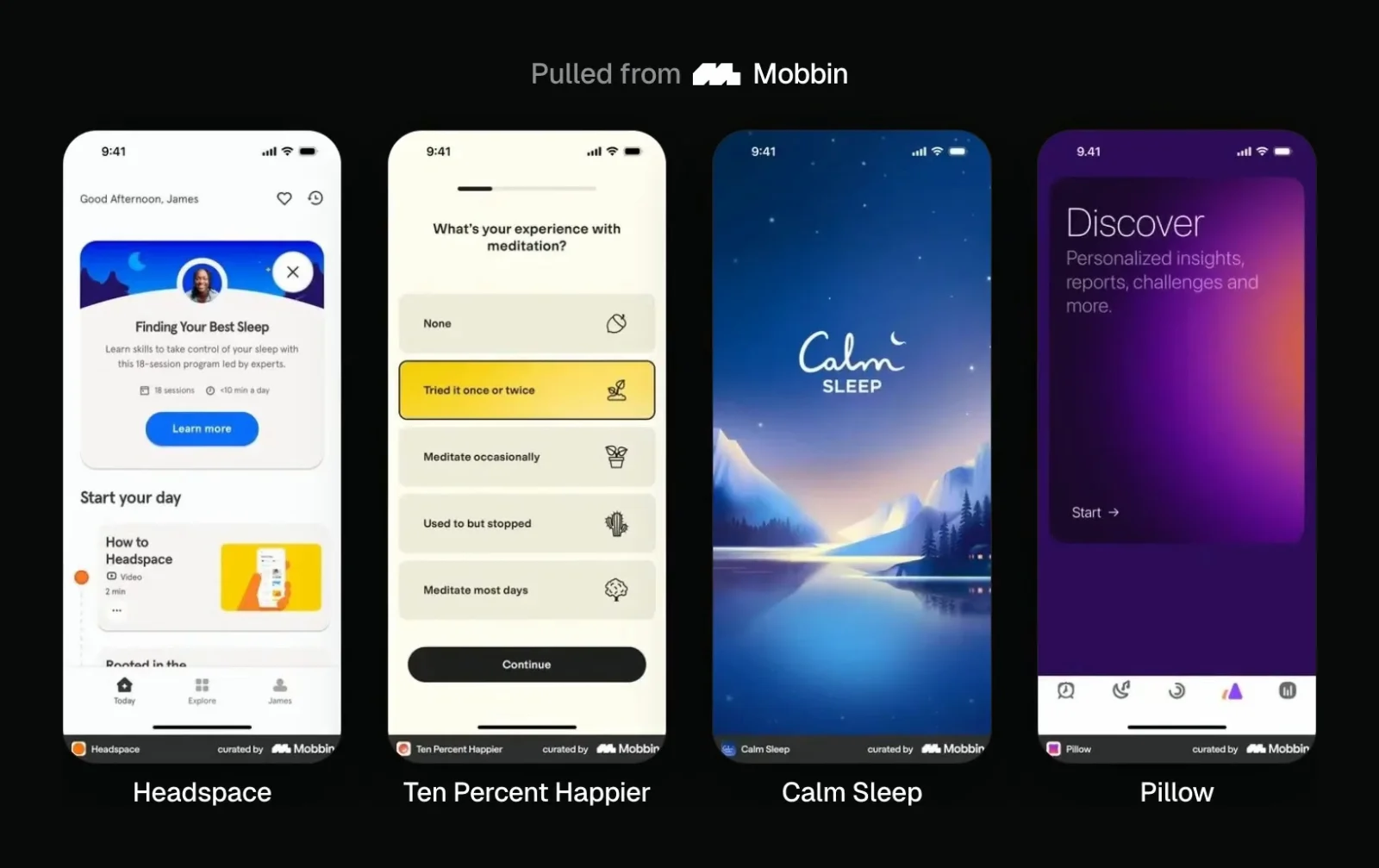
With Mobbin, Fable studied onboarding from Headspace, Ten Percent Happier, Calm Sleep and Pillow, and noticed none of the real sleep apps used a serif for their headlines, which its own first version had.
This time I pushed it further so the result wouldn't copy any one app:
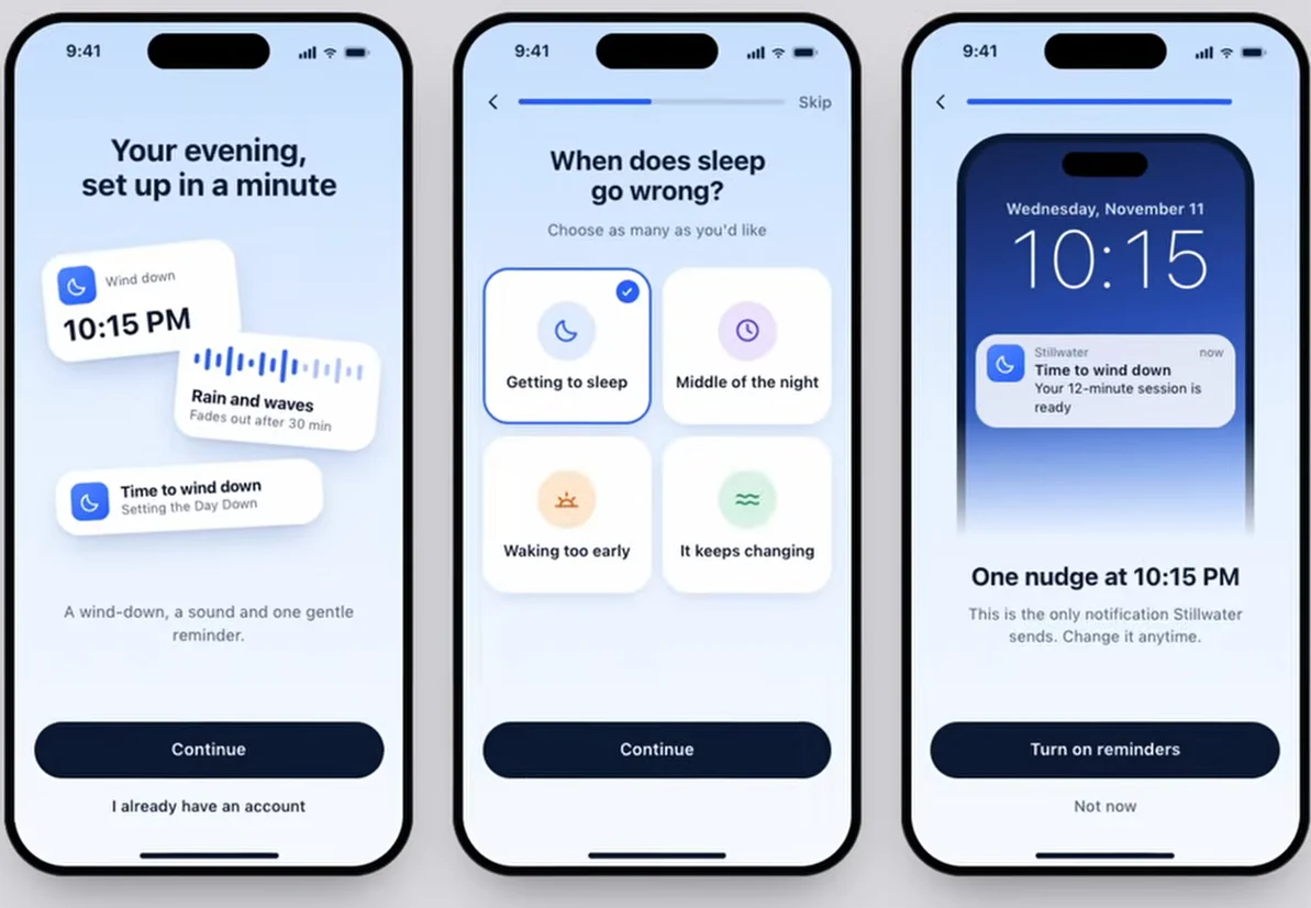
Give me five very different products, all based on the most modern sleep apps you can find on Mobbin. Each one should mix ideas from at least three apps.
I picked the third, Nudge. The report credits every idea to a real Mobbin screen. Floating cards on the welcome screen preview what you get before you answer anything, from Bevel. The goals are a 2x2 grid of big tiles, from Flo. And the flow ends on the exact lock-screen notification you will get before it asks for permission, an idea from Reddit and Slack, because people say yes to reminders more often once they've seen one.
Test 4: Brew, a coffee app checkout
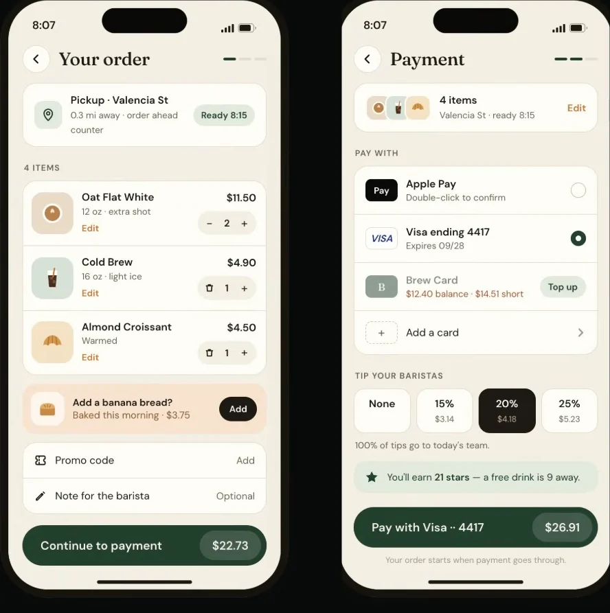
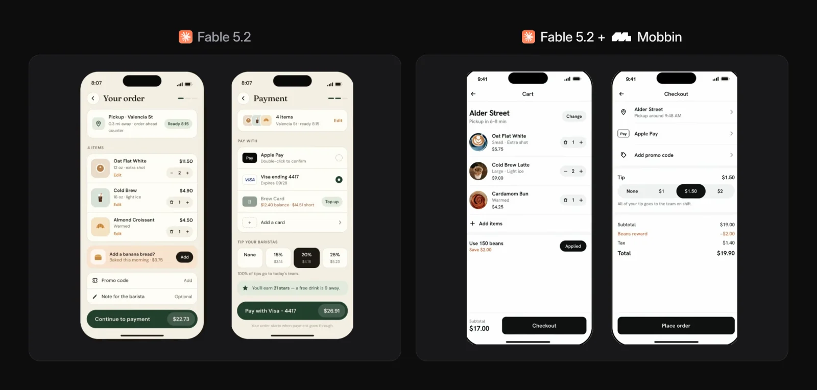
The brief: a cart screen and a payment screen for Brew, a coffee ordering app. The baseline is solid and still very generic, a good example of how Fable 5.2 on its own is not great at being creative or distinctive.
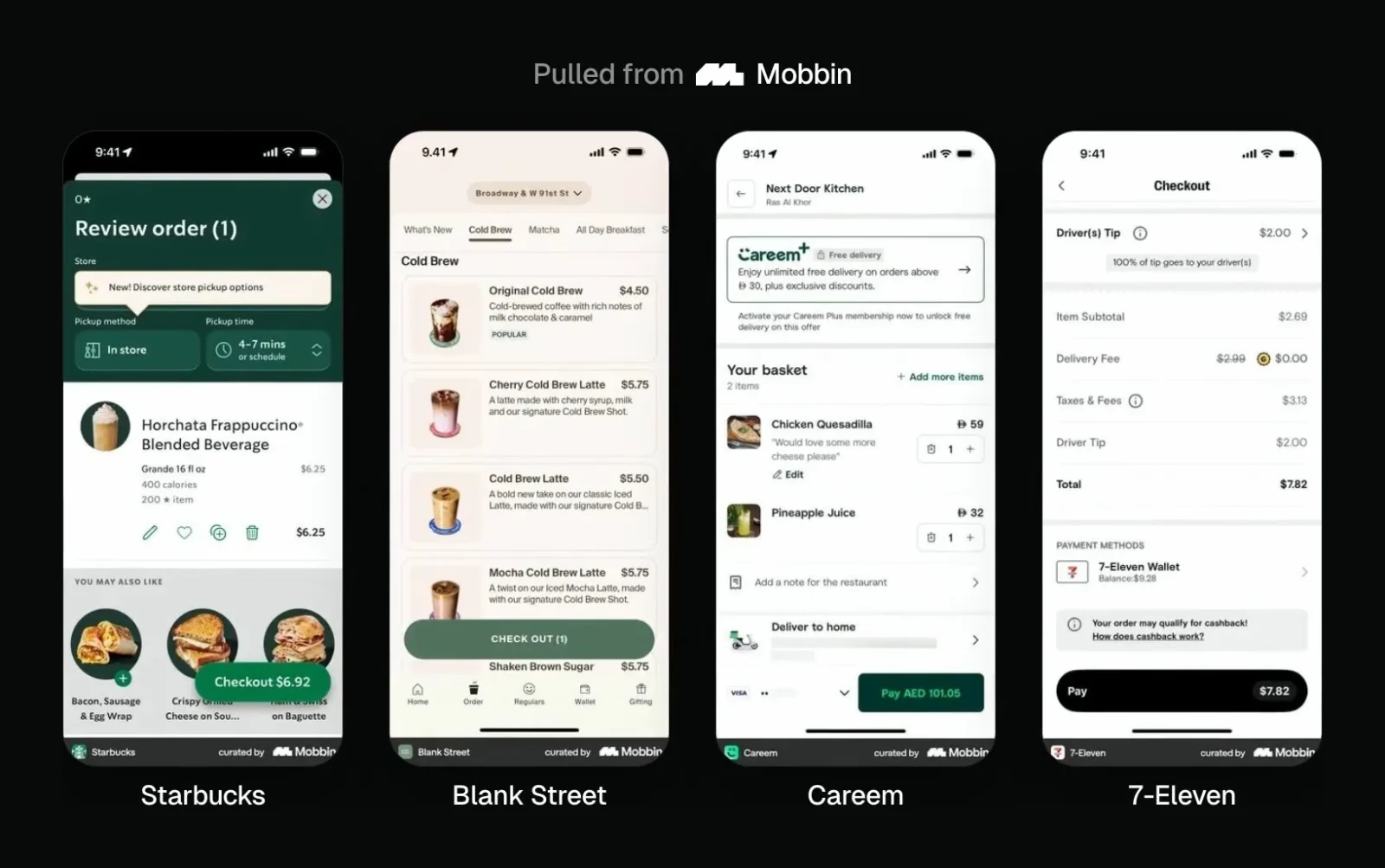
With Mobbin, Fable pulled checkout flows from Starbucks, Blank Street, Careem and 7-Eleven. Its biggest lesson: real checkout screens are flatter than you would expect. Its first version put everything in soft rounded cards, and real apps don't do that.
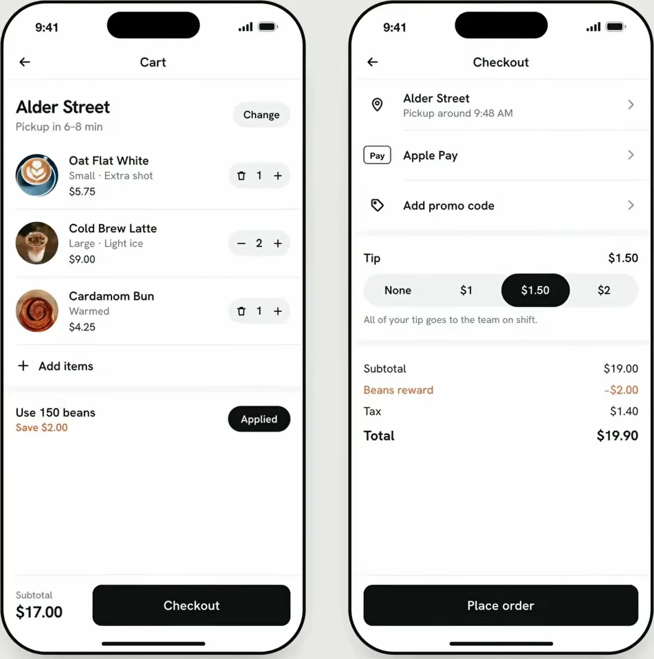
After five directions, I picked the fourth. Fable's report lists every change from its first version and the screen behind each:
- Serif headings became one sans in two or three weights, like DoorDash and Uber Eats.
- Orange everywhere became one brand color on the main button and almost nowhere else.
- Drawn icons became close-up product photos, like Starbucks.
- Boxed cards became hairlines and plain margins.
- A split dock of small buttons became one primary button per screen, with where and when in one line at the top.
It's all black and white, with color only on what you save, the way Uber Eats does it.
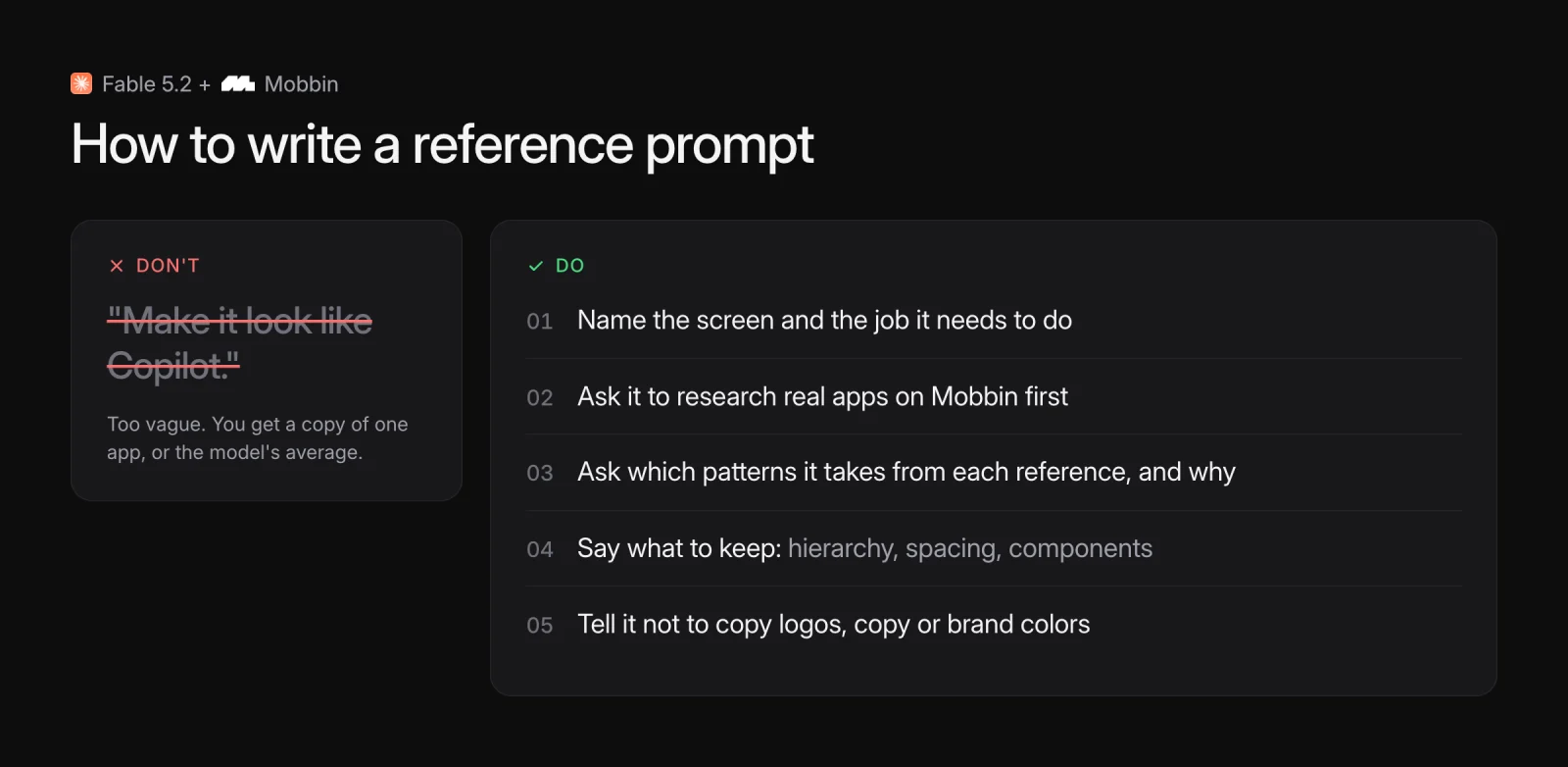
How to write a reference prompt
If you want to try this yourself, these made the biggest difference:
- Don't say "make it look like Copilot." Name the screen and the job it needs to do.
- Ask Fable to research real apps on Mobbin first.
- Ask which patterns it is taking from each reference, and why.
- Say what to keep: hierarchy, spacing, components.
- Tell it not to copy logos, copy or brand colors.
Here is a starting prompt that covers all five:
Use the Mobbin connector to research how real [category] apps design their [screen]. Pick the 3 or 4 strongest and tell me which patterns you're taking from each, and why. Then design the [screen] for [product], which needs to [job of the screen]. Keep their hierarchy, spacing and component choices. Don't copy their logos, copy or brand colors.
When the result still feels generic
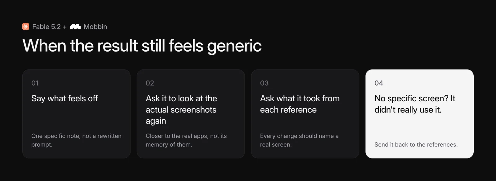
Don't rewrite your whole prompt. Say what feels off, and ask it to look at the actual screenshots again. Then ask it to explain what it took from each reference.
That last question doubles as a check. If it can't point to a specific screen, it probably didn't use it.
What this says about AI design
Better models alone won't fix generic AI design. Fable 5.2 is a better builder than anything before it, and its no-reference work was still the median. What changed the output was giving it the right tools, references and context: the ability to research how real products solve real problems, then apply those patterns to something new.
It doesn't replace designer judgment. In every test I still picked the direction, combined ideas and asked for specific changes. But the gap between an idea and a good interface is a lot smaller when the model starts from real screens instead of its own average.
Is this a workflow you would use, or do you still start in Figma? Tell me in the video comments.
FAQ
Without references, a model designs from the average of everything it has seen, so you get the most common version of each screen. Giving it real products to study, like Mobbin's 600,000+ screens, gives it specific choices to learn from instead of averages.
It is the strongest model I have tested for building interfaces, with clean, working layouts on the first try. On its own the designs are generic. With real references through the Mobbin MCP, the results were distinctive in all four of my tests.
It's a connector that lets Claude, Cursor, Codex and other AI tools search Mobbin's library of real app and website screens while they design. The agent pulls real screens into the conversation and explains which patterns it is using. It is included with Mobbin's paid plans.
Not if you prompt for it. Ask for ideas mixed from at least three apps, and tell it not to copy logos, copy or brand colors. In my tests every final design combined patterns from several apps and credited each one.
After the first result, ask the model to look at the actual reference screenshots again and give you five original directions. Picking from five is faster than rewriting your prompt, and it usually gets past the first generic idea.